
Let’s hear it for Marsala, the wine-influenced, red-kissed colour of 2015, as chosen by Pantone.

“Hardy, robust, satisfying, fulfilling. At the same time there’s a certain glamour that’s attached to this colour,” offered Leatrice Eiseman, executive director of the Pantone Color Institute.
Pantone’s yearly picks can herald a marked presence of a colour in fashion, beauty, housewares, home and industrial design and consumer packaging, though some years the influence is stronger than others.
The 2014 colour of the year from the forecasters and industry consultants was Radiant Orchid, a deep tropical purple.

The year before that it was Emerald green. Tangerine Tango had legs in 2012.

The idea, Eiseman explained in a recent interview, is not to choose a colour that will necessarily “overtake the world.” In Marsala’s case, she said, the shade is complex but grounding — brown-red with blue undertones for a dark blush effect.
Eiseman and her team travel the world to observe colour at play. For Marsala, they see an accent wall in a living room or office, a swipe of eye shadow mixed with bronze for a metallic look, a throw pillow, the exterior of a car or a bit of jewelry evoking the 1950s.
There’s a natural earthiness to the shade, announced Thursday, a full-bodiness like the cooking wine it is named for, without overpowering.
“It really does embody a certain amount of confidence and stability,” Eiseman said.
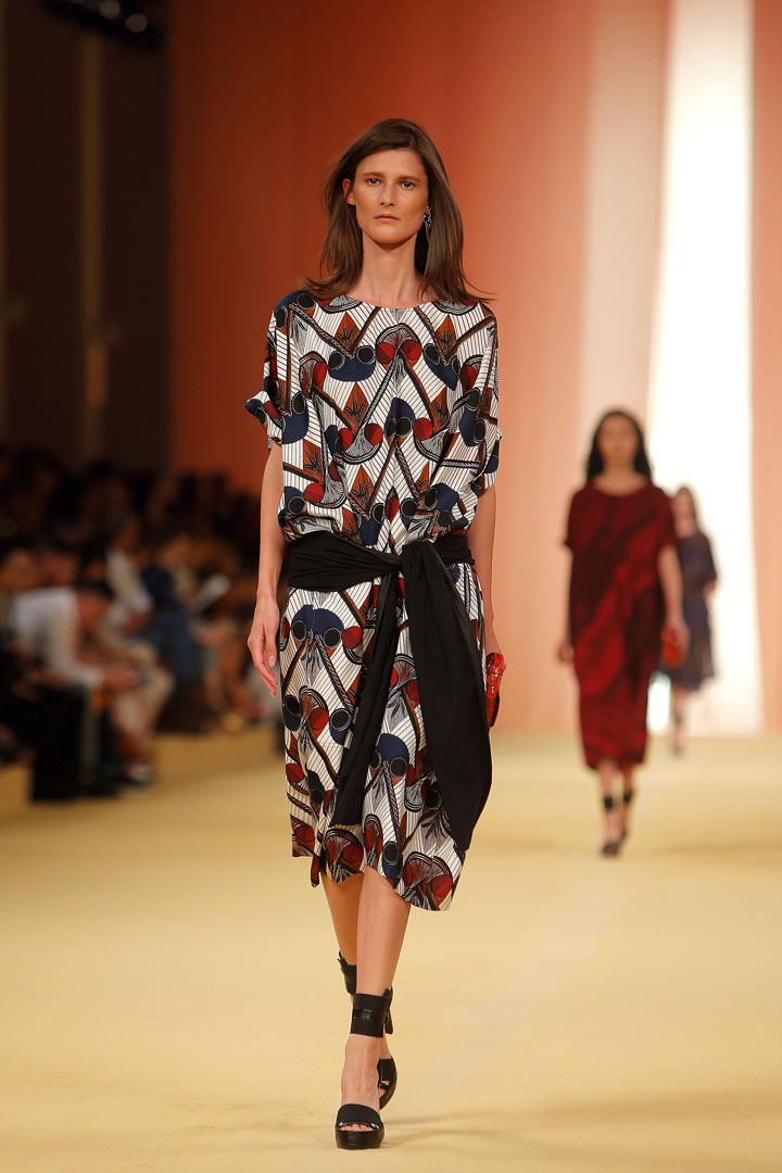
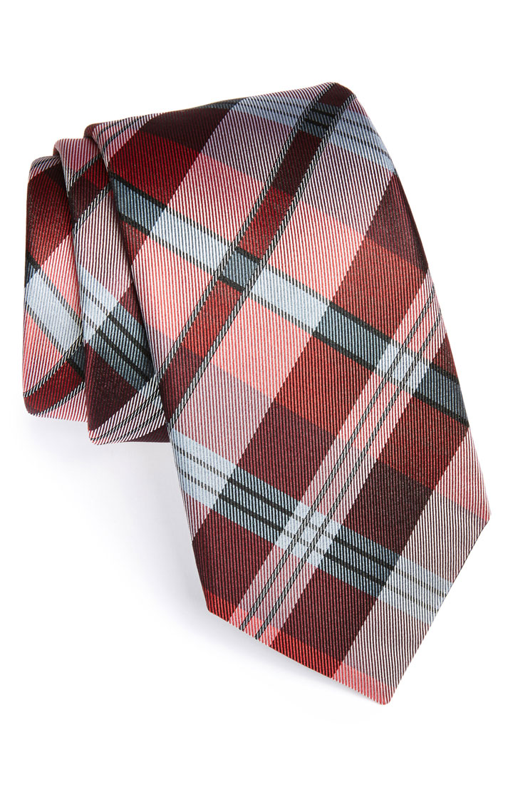
The hue isn’t a risky one, whether in a nail polish, a frock on a runway or a pattern of stripes in a men’s tie or florals for table placemats or bedding.
Eiseman noted the versatile shade was among colours Pantone flagged as spring/summer trends for 2015 earlier this year, as evidenced on the runways of Herve Leger by Max Azria, Dennis Basso and Creatures of the Wind, among other designers.
As they did with Radiant Orchid, the cosmetics giant Sephora plans a limited-edition collection of beauty products based on Pantone and its latest pick, Eiseman said. Marsala has been widely used in lipstick and hair colour for years.
One of the colour’s strengths, she said, is the ease in combining it with grey, black, beige and other neutrals.
“It’s a colour that you can mix with what you already own,” Eiseman said. “You can add just a touch of it. That’s the intent and purpose. It is not the colour that swallows the world.”
Comments