
The Sochi Winter Olympics are in full swing and Canada was quick to win gold, silver and bronze medals. The Olympics is the one and only event that gives countries the visibility on an international platform to show the world what defines them. As a branding professional, I feel the event is the ideal venue to position Canada as a credible and relevant country amongst its peers. On that front, we are very fortunate to have the key ingredients that define a great brand, the Blink Factor – the use of visual cues such as shape and colour to attract attention. The ability to own a distinctive, iconic shape and colour has allowed our Canadian emblem, our flag, to be recognized the world over due to the simplicity of the maple leaf, the strong use of red, and the visual metaphor of “coast to coast” represented by the two vertical bars. A recent study by the Canadian Government identifies the “Canada Brand” as representing the purity of our national resources, the grandeur of our landscape and natural treasures, in addition to the humble and collaborative, albeit potentially boring, persona of our population.

We view the design of our flag matter-of-factly, but it’s important to remember that the change from the original union flag was very controversial and not universally accepted. Our current flag is the result of the wisdom and desire by former Prime Minister Lester B. Pearson to redesign our flag in order to provide our country with its own distinctive and separate identity from the commonwealth. Our flag emerged from a design competition where the maple leaf design by George Stanley and John Matheson, based on the flag of the Royal Military College of Canada, was selected. For us boomers, we can still recall when the flag made its first official appearance on February 15, 1965, and it has served us well ever since.


Get breaking National news
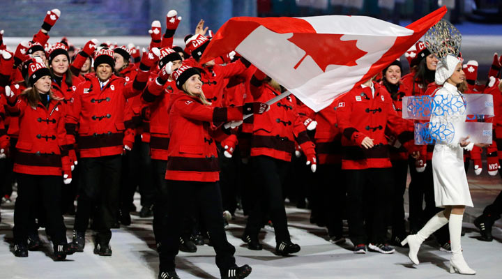
You do not need to look further than the Sochi opening ceremony to see a great example of the power of the Canadian flag and visual identity as our athletes entered the Parade of Nations, the most anticipated Olympics spectacle with 88 nations represented. As each country marched into the stadium, the Team Canada athletes, outfitted by HBC, looked striking with the strong use of our country’s red and white colours on their Olympic apparel. From a sea of thousands of athletes standing on the ceremony grounds, Canada truly stood out. This same theme has been extended to the Canadian uniforms for each Olympic sporting event, ensuring a strong national image, irrespective of how our Canadian emblem has been applied. It also makes it easier to follow the various athletes in the media as their uniforms and colours are clearly linked to the Canadian flag. We should take great pride in our athletes and our Canadian identity. Both are best in class and execute consistently, making us all one great country.
Go Canada go!
Comments
Want to discuss? Please read our Commenting Policy first.