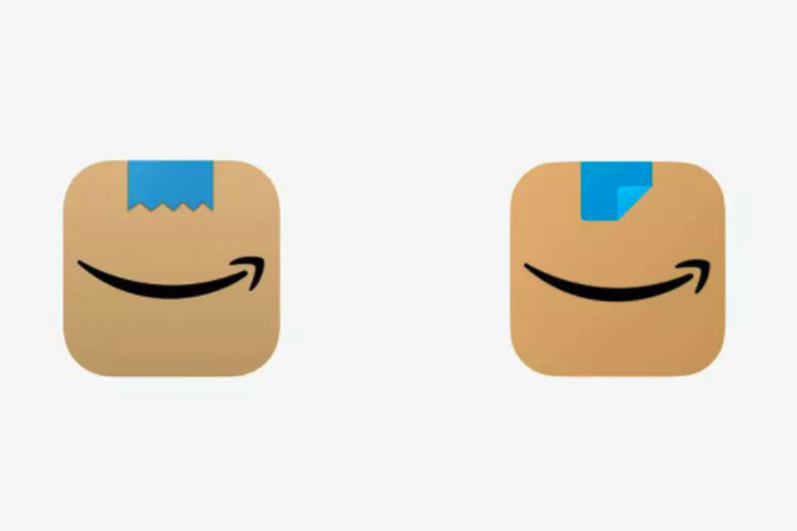
Amazon has altered the new box-like icon for its smartphone app, after the first design sparked comparisons to the smiling face of Adolf Hitler.

The new app icon depicts a brown cardboard Amazon box with the company’s arrow logo in the middle, and a blue piece of packing tape at the top in the centre. The tape on the first version of the updated icon was square with a ragged edge along the bottom, as though it had been cut by a packing tape gun.
Some imaginative social media users suggested that the box looked like the lower part of Hitler’s face, with the tape forming his signature toothbrush moustache and the Amazon arrow serving as his mouth.
The first box icon debuted in January, and comparisons to Hitler soon started bubbling up online in the following weeks.
Amazon quietly pushed a tweak to the app logo in late February, changing the blue tape to a square with one corner peeled up.

Get daily National news
The company did not explicitly say that the change was due to the Hitler comparisons.
“Amazon is always exploring new ways to delight our customers,” a spokesperson told TODAY in a statement. “We designed the new icon to spark anticipation, excitement and joy when customers start their shopping journey on their phone, just as they do when they see our boxes on their door step.”
Brand designer Laura Weldon, of Studio LWD, hailed Amazon for the change in an interview with BBC News.
“Brands change and tweak their logos all the time,” she said. “It reflects well on Amazon that they listened to their customers.”
The internet has also made it more challenging to design a logo without triggering major backlash, graphic designer Jason Forrest of Digital Ink told The Washington Post.
“I think rightfully so, the internet is more sensitive to these things,” Forrest told the Post, which is owned by Amazon.
The human mind is hardwired to see patterns — including faces — where they don’t exist, in a phenomenon known as pareidolia. It’s the same phenomenon that allows us to see animals in the clouds, Jesus in a piece of toast — or a smile in punctuation :)
The altered Amazon logo has provoked a new wave of comparisons to a much less controversial figure: Aang, the child-like hero from Avatar: The Last Airbender.
“Bye Hitler’s mustache,” one user wrote on Tuesday. “Welcome Avatar Aang!”


Comments
Want to discuss? Please read our Commenting Policy first.