

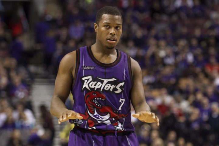
The NBA finalist Toronto Raptors have scrubbed the purple — and the dinosaur — from their current uniforms, but their original jersey remains a treasured fossil from a not-so-ancient era when outrageous colours, cartoon logos and pre-historic lizards ruled pop culture.

That first Raptors jersey featured all the trappings of 1990s design: an eye-catching purple base colour, a giant red dinosaur across the front and a busy scratch-mark design dyed right into the fabric. Critics dubbed it the “Barney jersey,” after the popular kids’ show at the time. But the big, fearsome Raptors logo also captivated a generation of young millennials who fell in love with the look, if not with the terrible team on the court.
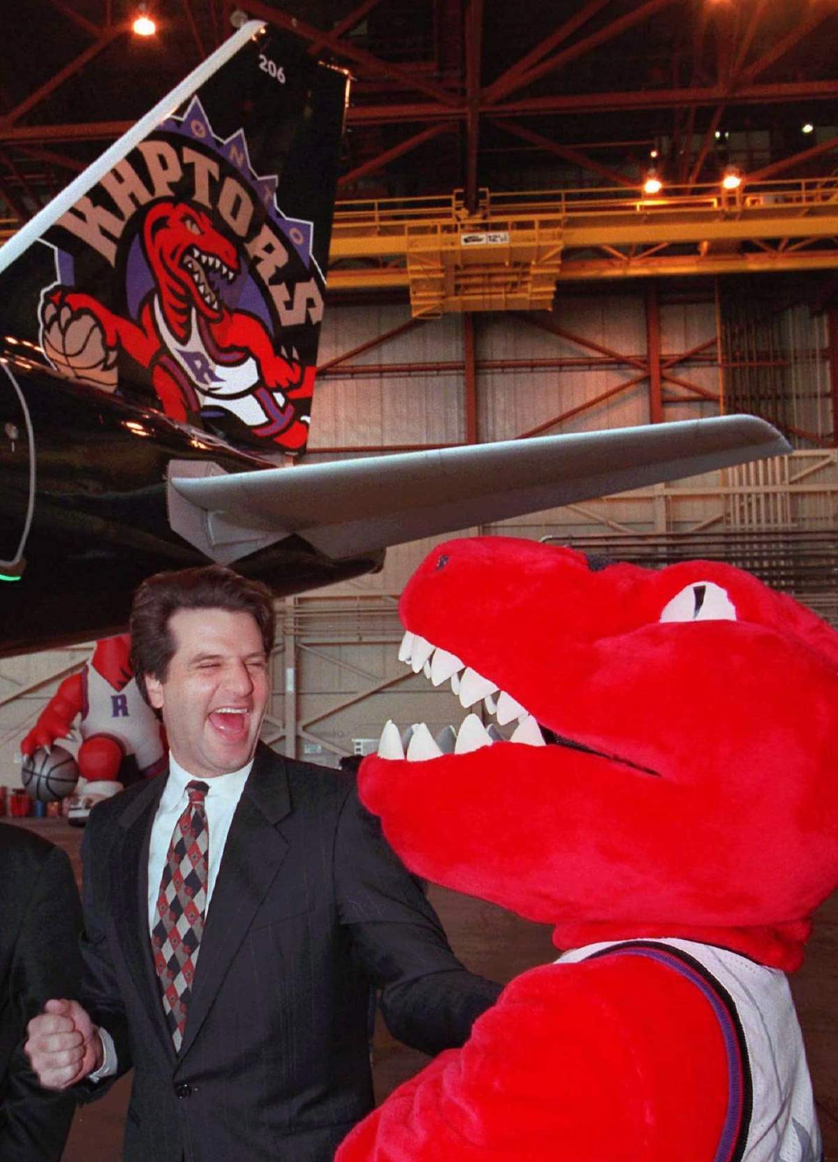
That’s exactly what Raptors owner John Bitove Jr. wanted when he worked with the NBA to design his new team images in 1993, two years before they were scheduled to play their first game.
“Make it the Happy Meal box of jerseys,” he told Tom O’Grady, the NBA’s creative director at the time. Bitove knew he’d have to sell a bad team in a market full of devoted Toronto Maple Leafs fans, so he wanted O’Grady to make the jersey as edgy and subversive as possible.
“We were targeting women, kids and new Canadians,” Bitove told Global News. “Let the old white guys follow hockey, but we’re going to get the next generation.”
WATCH: John Bitove Jr. reflects on Raptors’ first visit to the NBA Finals

O’Grady was more than willing to try something new.
“You’re talking about a unique name with an unusual colour combination and a highly provocative uniform,” O’Grady told Global News. “We probably wouldn’t do that today, but back then that was exactly the right formula to get the team noticed.”
Here’s how Bitove and O’Grady designed the Toronto Raptors franchise — and how it almost looked very different.
Choosing the name
Bitove’s ownership group won the Toronto franchise in late 1993 and kicked off a naming contest early the next year. The team ran a mail-in contest in the Toronto Star, then rounded up some of the best suggestions for a final round of telephone voting.
The final names included Dragons, Beavers, Bobcats, Grizzlies, Hogs, Scorpions, T-Rex, Tarantulas and Terriers.
READ MORE: A brief history of the Toronto Raptors
Bitove liked T-Rex the best, but his son Brett, who was eight years old at the time, had another idea.
“He said to me, ‘Dad, why don’t you like raptors?'”
A lightbulb came on in Bitove’s head. Steven Spielberg’s Jurassic Park had just shattered box-office records and blown kids’ minds with its zoo full of ferocious dinosaurs. The tyrannosaurus rex was a central monster in the film, but it was the velociraptors that captured many kids’ imaginations with their speed, ferocity, intelligence and pack-like mentality. Bitove wanted to market his team to those same kids.
“I don’t think there’s a male person in the world that hasn’t been fascinated by dinosaurs,” he said.
He added “Raptors” to the list of finalists and asked O’Grady to mock up some ideas for each name.
Get daily National news
WATCH: Meet Raptors superfan Nav Bhatia

O’Grady drew his inspiration from the NBA’s Charlotte Hornets, which joined the league in 1988 with a cartoonish hornet and a purple-and-teal colour scheme. With the Hornets’ logo in mind, O’Grady mocked up his own version of a basketball-playing dinosaur and presented it to Bitove, along with the other proposed names.
“Head and shoulders it was the best,” Bitove said of the Raptors logo.
The Raptors name won the fan contest and tested better than anything else in the focus groups, according to Bitove. He says the final decision was a no-brainer. The team would be called the Toronto Raptors.
The ‘Happy Meal box’ of jersey design
The Toronto Raptors were born in the middle of a uniform-making revolution. Sports outfitters had just figured out how to print images directly onto a jersey, rather than stitching it on with a stiff crest. This process, known as dye sublimation, meant the NBA could print large logos — such as a big red dinosaur — across the full lower half of a uniform.
Sports teams were also starting to experiment with unusual colour schemes. The Charlotte Hornets, as noted, were wearing teal and purple. So were two of the NHL’s newest franchises, the Anaheim Mighty Ducks and the San Jose Sharks. Several MLB teams were also swept up in the teal trend.
With Bitove’s “Happy Meal box” idea as his guide, O’Grady settled on purple to make the team stand out visually on the court.
“I don’t think we wanted to be the Hornets necessarily but there’s a lot to be learned from that identity,” O’Grady said.
O’Grady also deliberately left out anything overtly Canadian, such as a maple leaf, at Bitove’s request.
“He wanted to be more of an international brand,” O’Grady said. “He wanted this to be … as popular in China as it is in Toronto.”
O’Grady’s first version of the logo looked exactly like the final version except for one thing: the dinosaur was lime green.

Bitove liked the logo, but he was also facing pressure to include a nod to Canada, however subtle. The two men settled on making the raptor red and changing the bronze lettering to “Naismith silver.” The silver was a nod to James Naismith, the Canadian inventor of basketball.
-
![]() 12 youth injured after electrical issue at water park in Cultus Lake
12 youth injured after electrical issue at water park in Cultus Lake -
![]() ‘It’s all going to be OK’: Canada’s ambassador to US reassures ahead of CUSMA deadline
‘It’s all going to be OK’: Canada’s ambassador to US reassures ahead of CUSMA deadline -
![]() U.S. Coast Guard releases audio believed to have captured moment OceanGate’s Titan sub imploded
U.S. Coast Guard releases audio believed to have captured moment OceanGate’s Titan sub imploded -
![]() Saskatchewan Premier talks on European trade tour update
Saskatchewan Premier talks on European trade tour update


Next, Bitove asked O’Grady to make a uniform that was “off-the-charts unusual,” so it would stand out against the timeless look of his major Toronto competitor, the Maple Leafs.
“We can cycle out of this,” Bitove said at the time, according to O’Grady. “We don’t have to have this uniform in 25 years.”
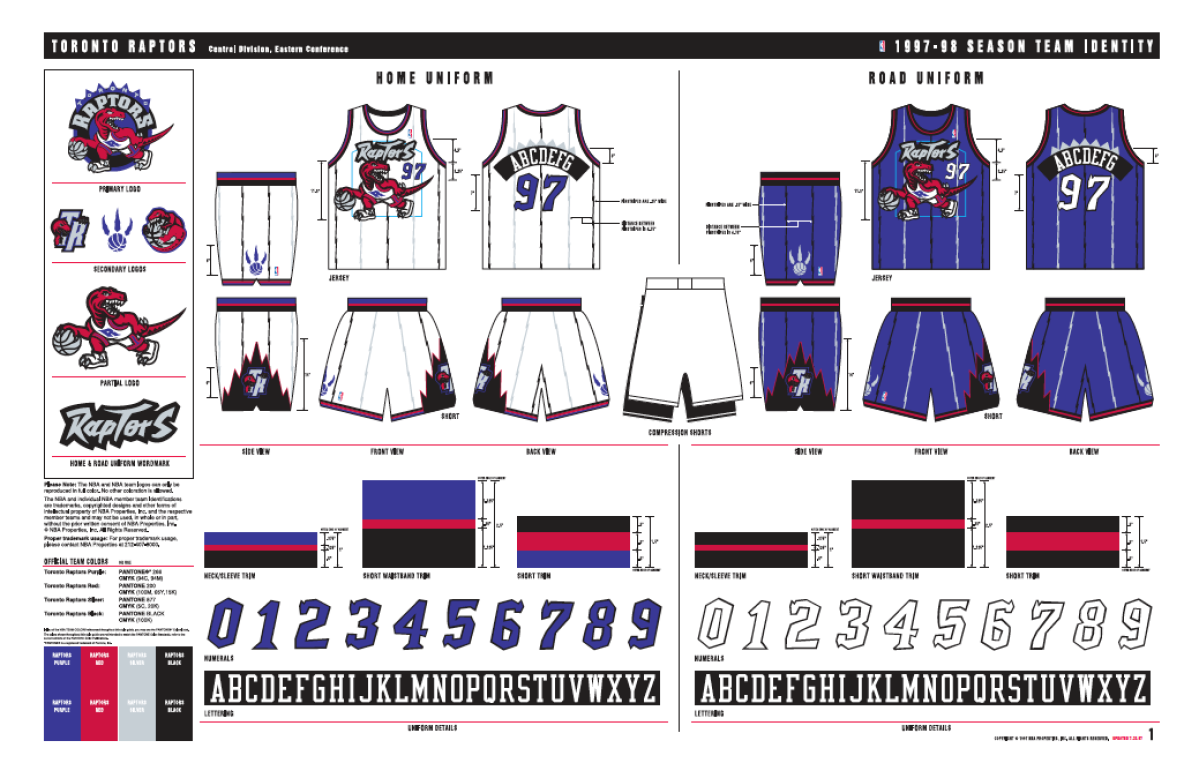
O’Grady came back with the winning design: a purple jersey with a big, red raptor printed across the front, with clawmarks for pinstripes.
The Raptors unveiled their new look on May 24, 1994, and immediately became one of the hottest-selling brands in the NBA. Fans bought more than US$20 million in Raptors gear within the first month, and the team ranked seventh in NBA merchandise sales before it even played a game, according to the league.
Bitove says the uniform did its job by appealing to kids between the ages of six and 10. He suspects it may have even helped lure the team’s most famous fan, Drake, who would have been in that age bracket at the time.“They grew up with this (Raptor) figure in their lives, and that’s what we wanted,” Bitove said. “It’s hard to hug a maple leaf. It’s easy to hug a raptor.”
The Raptors get a ‘We the North’ makeover
The Raptors eventually fell in line with league tradition and removed the giant dinosaur from their uniforms in the late ’90s, after Bitove sold his stake in the team.
However, they kept the purple colour scheme until 2014, when new owners Maple Leaf Sports and Entertainment hired an advertising agency to redesign the franchise’s identity.
The agency launched the now-famous “We the North” campaign, along with the Raptors’ new red, silver and black colour scheme and logos. It also removed the actual dinosaur from the current Raptors team identity.
WATCH: Toronto Raptors unveil ‘We the North’ campaign
Bitove says the original design was never meant to last, but he wishes the Raptors would use it as a secondary uniform a few times each year. They’ve only done so a few times since shedding the purple in 2014.
“It’s kind of our (New York) Yankee pinstripe uniform and they’re not using it,” he said. “That’s fine.”
O’Grady says he’s not a fan of the new design because it’s too “bland.”
“It seemed to scrub purple right out of the equation,” he said. “In the process, I think it lost a little bit of its personality.”
Both men are happy to see the team playing in the NBA Finals for the first time. They’d just like to see the Raptors pull on a purple jersey before it’s all over.
“Things change, they come and go,” Bitove said. “It’s still the most popular uniform ever.”
Comments
Want to discuss? Please read our Commenting Policy first.