A year ago, menswear-inspired decorating was wildly popular. Interior designers hung sharply tailored draperies alongside furniture covered in pinstripes. Sophisticated shades of grey were everywhere, as was navy blue.

But “since the pendulum always swings, we’re starting to see fresh feminine spaces,” says interior designer Brian Patrick Flynn, “regardless of who lives in them.”
The trend that designers are calling “the new feminine” isn’t a return to an excess of florals, shabby-chic lace and other cliches of feminine decor from a decade ago. Instead, “feminine style” has evolved into “an esthetic that’s classic with a soft, eclectic spin,” says Flynn, founder of Flynnside Out Productions.
Pretty is back, but designers are using traditional florals on furniture with edgy, sleek lines to create modern mashups. Even the colour pink has enjoyed a makeover: Pantone’s “colour of the year” for 2015 is a sexy, dark pink called “marsala” (see below).

“There was a period in design when ‘pretty’ or ‘feminine’ were considered bad words,” says New York-based designer Young Huh. “It was considered lightweight and not serious. Ideal rooms were masculine, a bit sombre, devoid of pattern and softness. Recently, there is a return to appreciating traditional design and also pretty rooms.”
Believe it or not, Huh says, “there is a new generation discovering chintz and florals.”
So how do we pull off this new look to give rooms a beautiful, feminine touch without getting too “girly”?
—
CONTRAST IS KEY

Anne Maxwell Foster and Suysel dePedro Cunningham, the designers behind the design firm Tilton Fenwick, suggest layering a feminine room with an eclectic mix of furniture and patterns.
“We love traditional-style upholstery details (like a gathered skirted chair, for example), but aren’t afraid to pair it with a clean and modern side table,” they said in an email.
Huh also emphasizes contrast: “When I think of feminine elements, I turn toward traditional design, such as the curvilinear shapes of Louis VI pieces, floral or other nature-inspired textiles and wallpapers, trims and passementerie, and traditional curtain and furniture making,” she says. “But to make the style fresh and modern, make sure the room contains contrasting elements that are edgy, clean and contemporary. … Having modern bookcases, simple moulding and contemporary architectural lighting make the feminine embellishments look new and fresh within that context.”
—
SHAKE UP THE COLOURS

Pink is possible, but it doesn’t have to be your starting point.
“I’ve been designing and decorating homes for eight years, and not once has a female client asked for a pink room,” says Flynn. “There are so many colours to choose from that add a soft, feminine spin. … You can never go wrong with white on white, but if that’s too impractical, mint green and red, lavender and white, and turquoise mixed with just about anything are excellent modern-day feminine options.”

If your heart is set on pink, he says, “pair it with navy blue. Dark blue and muted pink strike a gender-neutral balance and also create a super preppy vibe.”
The Tilton Fenwick designers suggest uncommon colour pairings. “Color combinations like olive green and turquoise, for example, feel unique and fresh rather than stuffy and dated,” they say. “It allows you to use traditional patterns in fabrics and textiles without feeling dowdy.”
One of Huh’s favourite tricks for giving a feminine room edge is to add black (or another “masculine” colour). “Paint some moulding black, the legs of a chair, add black trim to traditional chintz pillows and all of a sudden you’ve made that ‘nice girl’ look sexy,” she says.
—
DON’T FEAR THE FLOWERS
Although an overload of floral patterns will look dated, don’t avoid flowers completely if you love them.
“Florals are a great starting point for a feminine feel” but pair them with a more modern and clean palette, say the designers at Tilton Fenwick. They also suggest mixing in “more modern or unexpected furniture pieces, art and accessories – a modern photograph for example – that adds a layer of interest.”
—
BREAK THE RULES
If a client wants some shabby chic, Flynn gives it an eclectic twist. “Instead of the classic shabby chic look of white lace, weathered ivory finishes and lots of silver,” he says, “I like to simply stick with weathered wooden finishes in high energy colours, then mix hand-woven or blocked prints in. This results in a well-travelled look packed with organic textures and shapes.”
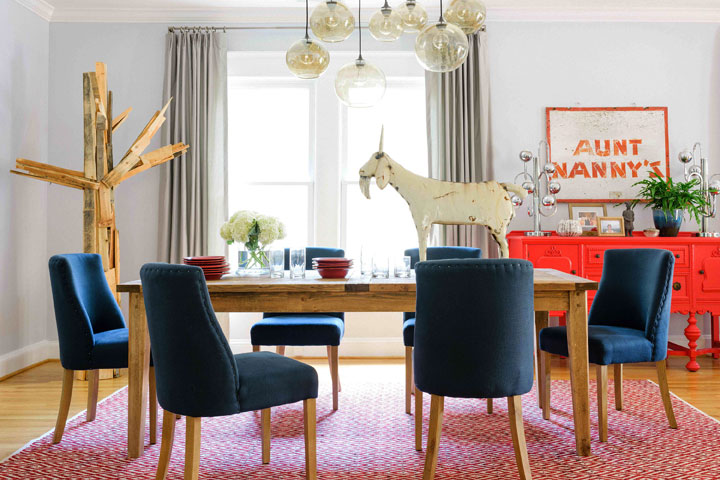
Take it a step further and you’ve got what Flynn calls “rustic elegance” – “the clever juxtaposition of weathered finishes and farmhouse elements mixed with clean, tailored lines.”
“I just completed a dining room which my female client wanted to feel very folk-art-inspired. To pull it off, we covered the walls and windows with a soft shade of grey, added tailored drapery and then brought in almost all worn, weathered pieces. While there are definitely moments of femininity, the space is just as appealing to men as it is to women.”
Comments