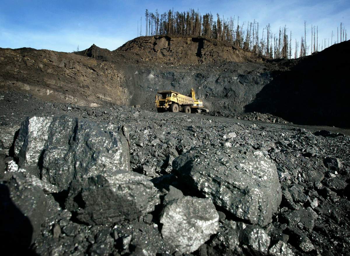
Here is a map of coal mines in operation around B.C.

The blue pins represent the current mines. The red pins represent the proposed mines.
The ships represent the ports that ship coal to other locations.
Use the ‘+’ and ‘-‘ to zoom in and out of the map, and click on each icon to learn more about the facility.
Learn more from our in-depth coverage of the coal debate in B.C.


Comments
Want to discuss? Please read our Commenting Policy first.