
An attempt by Dalhousie University to refresh their social media identity earlier this year met harsh criticism from donors, alumni and current students.

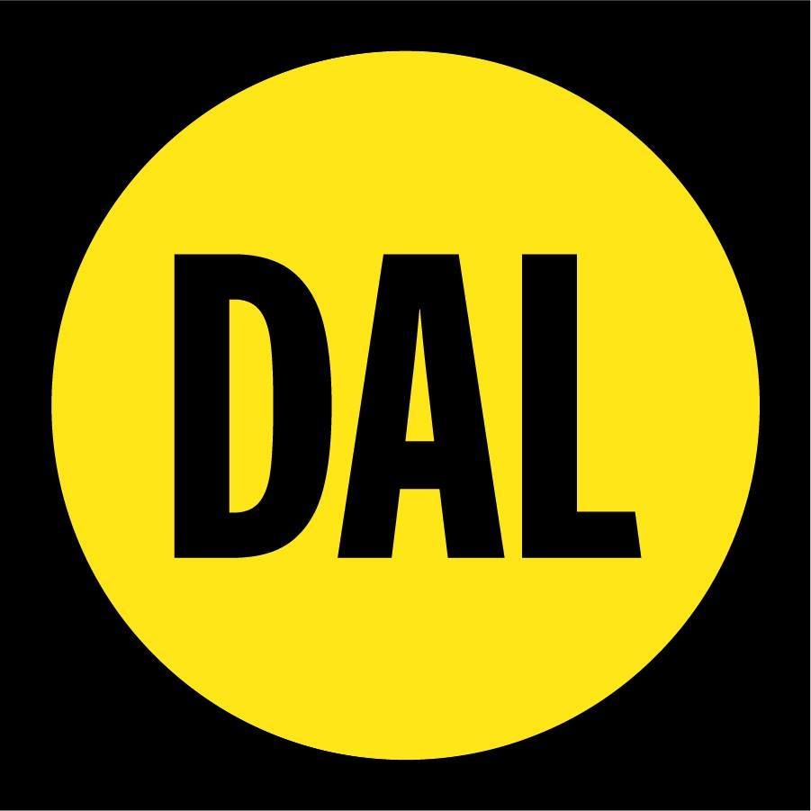
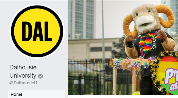
The move to adopt a new circular, black and yellow logo resulted in angry emails calling the decision “terrible” or an “absolute embarrassment.”
One man went as far as comparing the new logo to the “Batman spotlight” and asking if Atlantic Canada’s largest university had hired a 10-year-old to design it for them.
“It is quite baffling that it was even accepted,” the partially redacted email reads.
Nearly 250 double-sided pages of documents, released under a freedom of information request, lays out Dalhousie University’s goals for their new social media icon, and how the public entity — which receives hundreds of millions of dollars in funding from the provincial government — responded to the growing backlash.
READ MORE: How Halifax police used a stuffed animal to make you like them more
The documents consist of planning memos, internal emails, guidance documents and briefing materials.
One document, titled a “social media identity exploration” reveals the switch to a black and yellow logo was meant to as a follow-up to Dalhousie University’s 200th-anniversary celebration.
The 200th-anniversary logo was used during the 2018-2019 school year across all of the school’s major social media accounts. It was a modified version of the school’s crest logo, incorporating a shield on a background of fireworks, with an eagle being used as the central figure on the shield.
In contrast, the new logo would be bright and use “Dal”, the colloquial of Dalhousie University, for the brand. The hope is that it would allow for a hip and “less corporate” look for the school while also offering a unified brand identity that would “better the reputation of all corners of Dalhousie.”
It’s a decision echoed by Sarah Dawson, a spokesperson for Dalhousie University, when asked for comment on the icon’s rollout.

Get breaking National news
“The Dalhousie University brand model is based on insights gained from extensive research and consultation, and with strategic work from our internal marketing, design and digital expertise, took a bolder, fresher look to our social media icon design,” Dawson wrote in a statement.
“We’ve undertaken efforts to ensure social media icons across Dal’s faculties and departments are using the same iconography.”
WATCH: Social media influencer challenges Reitmans over branding

Fallout
But it’s clear that not everyone agreed with the move. Criticism began flooding social media soon after the new icon was widely adopted on April 29.
Within 48 hours Dalhousie University had received five emails about the change to the social media icon on LinkedIn and an increase in “negative Twitter and Facebook chatter”
At the core of the backlash was the misconception by the public that the new social media icons were a new official Dalhousie logo rather than a social media branding tool
- Ontario education minister ‘clarifying’ students will be allowed to miss class for sports
- Ontario education minister urges parents not to pull kids from school for sports
- Saskatchewan NDP urges province to repeal pronoun law affecting LGBTQ+ youth
- Officials urge Calgarians to play it safe on the water this summer


Lyle Quinn, a digital manager with Dalhousie University, wrote that it was important to clarify the misconception “sooner rather than later” in an email to staff.
The pushback sent staff scrambling for a response to the “#drama,” as one staff member described it.
On May 1, Quinn even wrote a page-long email proposing that the school “discontinue the use of our new ‘bold & fresh’ icon” on the university’s official LinkedIn profile.”
He justified the proposal by saying that the LinkedIn audience is a unique, professional network that requires a “strongly corporate/formal tone of voice” and that the response had not gone “well.”
An angry alumnus even phoned the school, asking if he could lodge a “formal complaint” and request for it to get changed back.
“To use a more casual and ‘bold’ icon… will likely not serve us well in the long run, reputationally,” Quinn wrote.
By the next day, the icon on the school’s LinkedIn page had already been switched to the image of the Dal Crest. It’s remained that way ever since.

But the backlash continued.
One alumnus said he believed Dalhousie could create a better logo than something that looked like it had been “done in MS paint 99.”
Another said he and fellow alumnus felt the new icon looked like a logo a “no-name brand or dollar store would have.”
Others simply called it “hideous” and that Dalhousie deserved a logo that reflects “how awesome the university is.”
READ MORE: Rebranding of Nova Scotia’s health districts to NSHA cost $231K
But Dalhousie University pushed forward despite the criticism. They offered a response to the critics, thanking them for their feedback and promising to talk it through internally.
“Our Facebook, Twitter and Instagram icons reflect our new social media identity. And there are no changes to Dalhousie’s official logo.”
Comments
Want to discuss? Please read our Commenting Policy first.