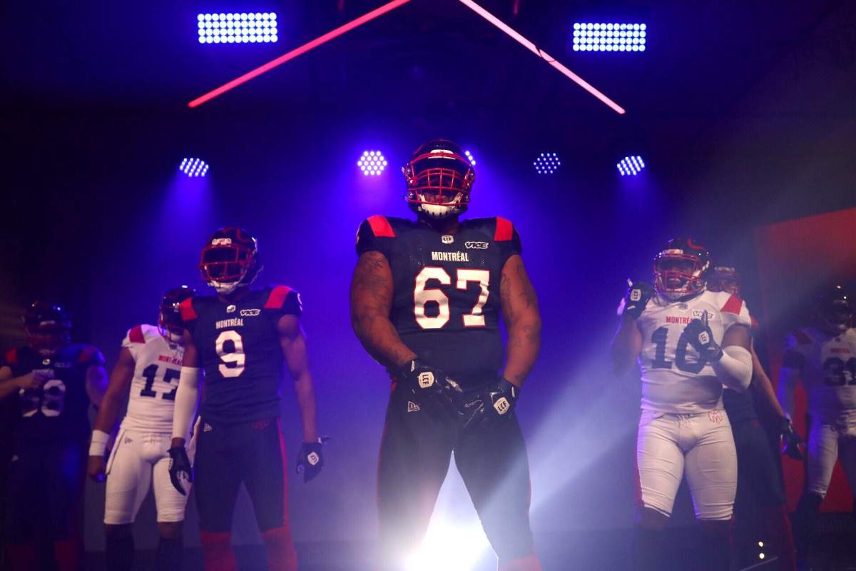
The Montreal Alouettes have unveiled their new look and to say that they’ve gone off the board with their design is understating their rebrand.

The team’s colour scheme remains the tradition blue, white and red – or bleu, blanc et rouge – if you will.
The Alouettes away uniform is comprised of a blue jersey with white numbers with red piping, blue pants, and red socks. The team’s home uniform is a white jersey with blue numbers, along with white pants and blue socks. There’s also a red stripe on the shoulders and both jerseys and each set of pants. The uniforms are simple, but slick.

Get daily National news
It is the helmet, however, that has garnered the most attention, and rightfully so. It’s something the CFL has never seen before.
The logo, a simple outline of a bird that also creates the letter ‘M’, sits on top of the helmet as opposed to being featured on the side. Four of the team’s previous logos are also displayed towards the back of the helmet, providing a unique way of paying homage to the franchise’s history.
Johnny Manziel heads into his first full CFL season

While I really like the uniforms, the helmet and logo leave much to be desired. The logo, and its placement on the helmet, gets checkmarks for creativity but falls short of inspiring a fanbase that is searching for an identity.
My first impression of Montreal’s new logo was, “Are they changing their nickname to the Doves?”
Remember, this is a franchise that just lopped off 5,000 seats at Molson Stadium for the 2019 season because of dwindling interest in the Alouettes. And that’s after the stadium underwent renovations in 2010 to boost the capacity by 5,000 seats.
Missing the playoffs for four straight years doesn’t help. My fear is neither will a new logo and threads.


Comments