I tend to side with the mayor on the latest flap over Calgary’s public art program. Seems to me, it’s more of a mix-up than a major scandal.

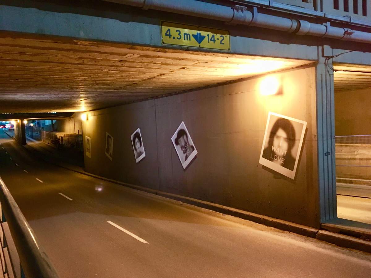
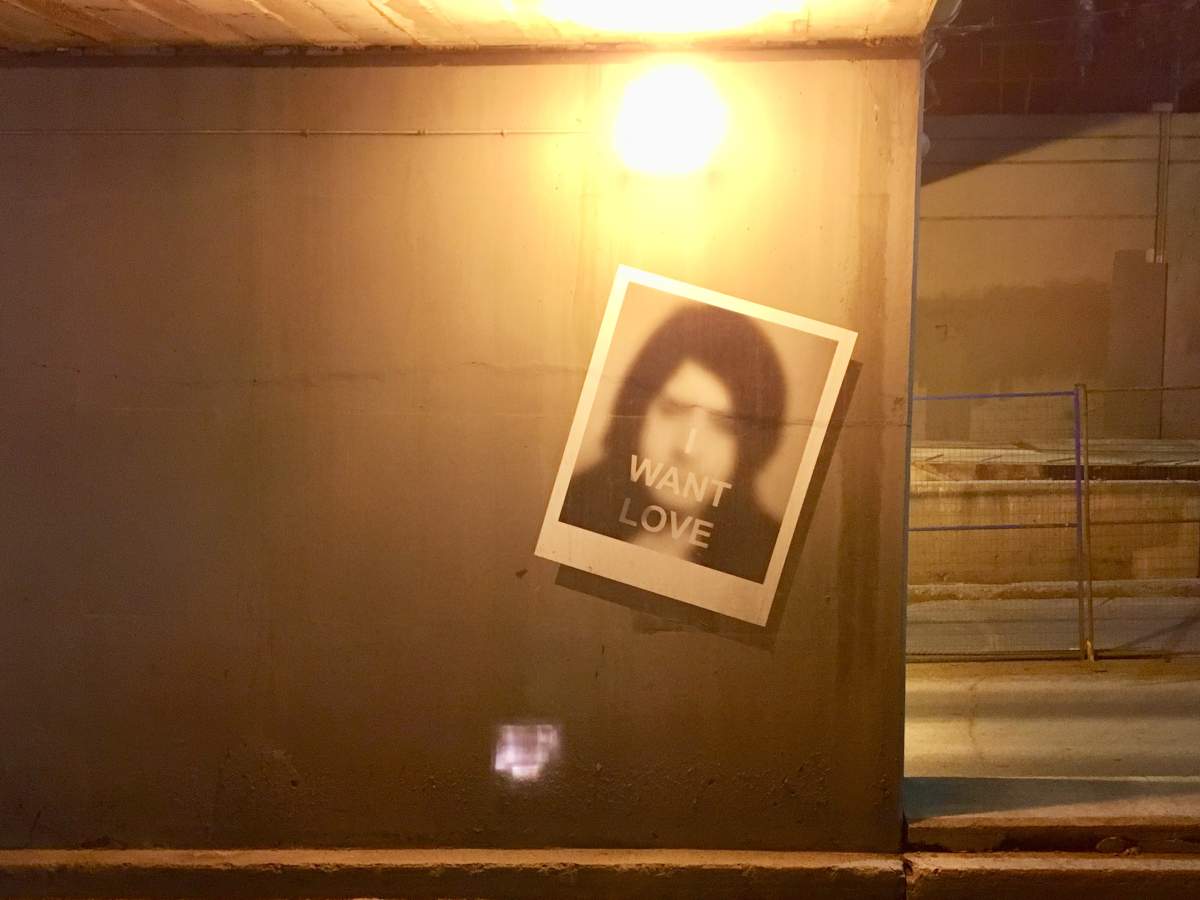
On Wednesday, the artist, who used the photos without permission, apologized. He said he thought they were “public domain.”
I believe him, seriously. If I thought images that would be blurred out for a temporary display in a dark underpass were public domain, I doubt I’d do extra sleuthing to make sure those fuzzy faces were cool with the partial exposure.
Ah, but these days public art is under the microscope. Even a slip can turn into a $20-thousand screw up and outrage of the week.
Get breaking National news
As the much-maligned public art program gets a much-needed review, here’s my two cents on how to move forward: keep it simple, stupid.
That old chestnut– the KISS concept– still works.
I just returned from a trip to Toronto and stayed in a downtown hotel. As my wife and I wandered along Yonge street, taking in the sights, we stumbled upon a little green space in the middle of the skyscrapers. It was a dog park. I knew that to be the case and I didn’t even have to read a plaque.
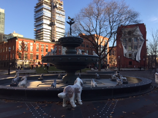
In the middle of the park was a three-tiered fountain with a huge dog bone mounted at the top.
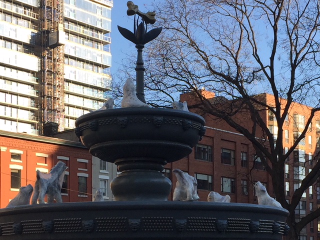
All around the fountain, there were statues of big dogs, small dogs, long dogs and short dogs, gazing up, dreaming of the bone. We laughed; it was hilarious!
A little green space turned into a funny stopover for Lassie and friends. A silly concept that connects, even if you’re a cat person.
I don’t think all public art needs to be that obvious, but maybe we should just keep it simple for a while.
I mean, do all art pieces really need to come with an explainer?
P.S. Take a look at the mural on the side of the building near the dog park. It’s also pretty cool.




Comments