
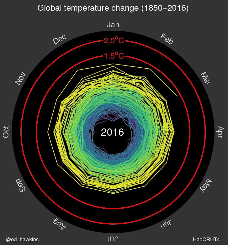
In the past century, our planet has warmed by about 1 C, due in large part to increased carbon dioxide and other human-made emissions in our atmosphere. Now a climate scientist has created a unique animated graphic detailing Earth’s increasing temperatures as they spiral upwards.

READ MORE: Climate change: Does a warming climate mean more wildfires?
Ed Hawkins is a climate scientist at the National Centre for Atmospheric Science (NCAS) at the University of Reading, in the United Kingdom. He created the graphic using data from the U.K.’s Met Office and plotted the data from 1850 to March 2016 using monthly values. The 1850 temperature is plotted as 0 C.
READ MORE: Climate change: Why world leaders want to stop Earth from warming 2 C

Get breaking National news
“It was just designed to try and communicate in a different way. As scientists I think we need to communicate, and try different things, and this was just one of those trials, and it has turned out very well,” Hawkins said on the NCAS website.
Fifteen of the 16 warmest years have occurred since 2001 (there have been several ties). The global temperature in 2015 shattered the previous record — set in 2014 — with an anomaly of 0.90 C compared to the annual average measured from 1880–2015.
More than 150 countries signed the Paris Agreement on climate change in April in an effort to stop global temperatures from rising 2 C by the end of the century.


Comments
Want to discuss? Please read our Commenting Policy first.