

All nine Signature uniforms have now been revealed. And we can now declare a winner, and more than a few losers unfortunately.

Here is my CFL Signature uniforms power ranking.
READ MORE: Fans feeling blue over Bombers new jerseys
9. Alouettes
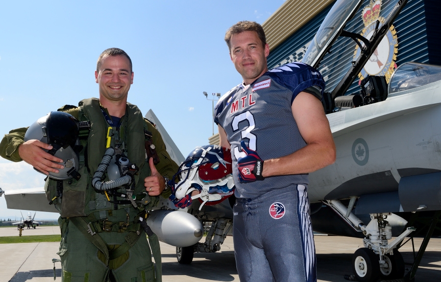
The Alouettes come in last place for me. Honouring our military heroes is good. A uniform looking like smeared blob of grey paint on a child’s easel is bad.
8. Eskimos

This seems like a throwback jersey more than anything–something I would remember Warren Moon wearing as he lobbed TD passes to Brian Kelly. I hoped/expected that they would go in the direction of the Oregon Ducks of the NCAA, or an updated version of their mid-2000s alternate jersey:

This new one is not doing it for me. Gold/yellow was very underutilized when considering this year’s Signature uniforms.
7. REDBLACKS
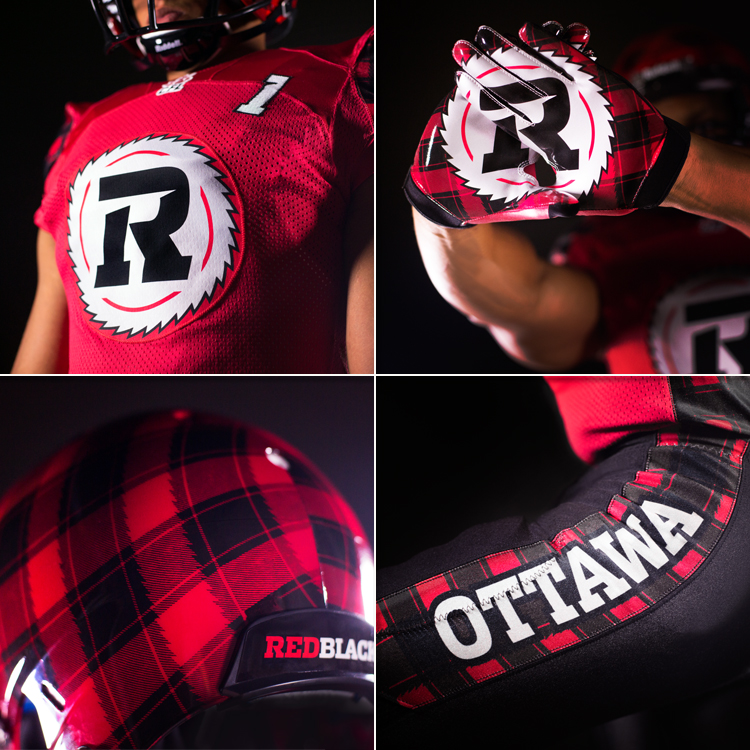
Thank goodness the REDBLACKS finally got new uniforms. Seven games was enough.
Get daily National news
BTW: Tartan helmets? Really?
6. Tiger-Cats
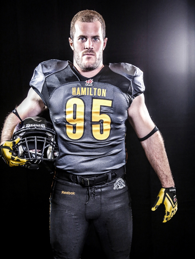
There’s nothing really wrong with the Tiger-Cats offering. And it only helps to make Brian Bulcke look meaner. But I really wanted them to do something more with the gold. Three teams used black as their main color, and it would be too easy for me to fall in love with them all. My disappointment with their use of gold puts them down this far.
5. Bombers

I have to say, these uniforms started to grow on my when I saw position players wearing them. Lineman looked slimmer, but this isn’t a tux for the CFL awards.
I think RB Paris Cotton said it best when he said about the helmets: “Ummm, yeah,” and followed it up with a curious-parakeet-like head tilt.
Not a lick of gold.
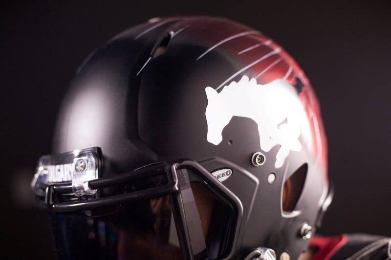
4. Stampeders
- Manitoba Moose face elimination again after Game 3 loss to Grand Rapids Griffins
- Call of the Wilde: Montreal Canadiens begin series against Buffalo with 4-2 loss
- Road closures, drones, and new stadium rules for FIFA World Cup in Vancouver
- Winnipeg Blue Bombers quarterback Taylor Elgersma hits field for rookie camp


After seeing the early leaked photos of the helmet, I thought Calgary was going to be my favorite. From the back, it looks like that moment just before the Enterprise hits warp speed. But again, black is too easy.
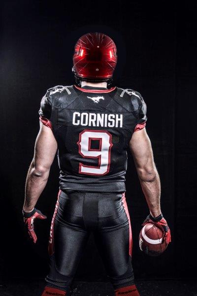
Points for white lettering for easy reading for fans, and for the shoulder six-shooters.
3. Argos
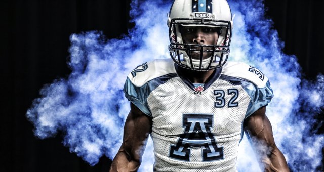
I called these the “uniform equivalent of store-brand perogies” at first sight. But having seen what seven other teams put out, these are slick. I love the little hits of the baby blue color. They were pushing for second place in my rankings.
2. Lions
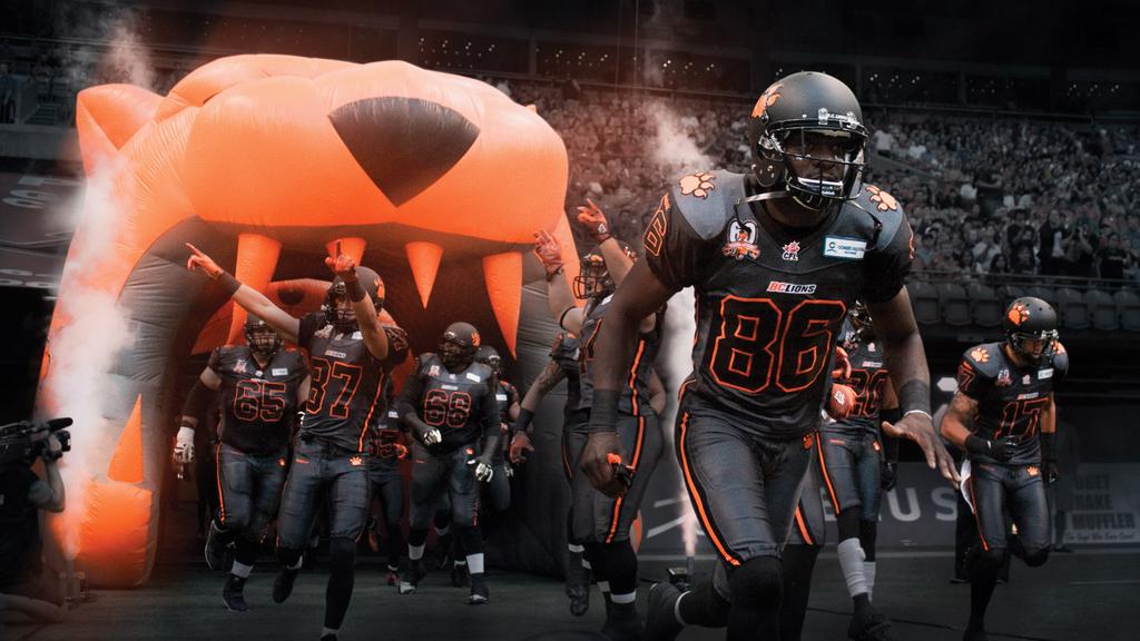
Flat out, the Lions uniforms are awesome. But I have to subtract points for going with black. It’s too easy to look cool in black.
1. Roughriders
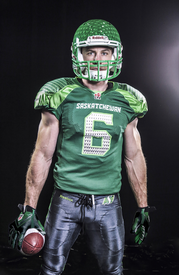
It hurts to say this, but I’m loving the shades of green they chose. And the helmets evoke watermelons for me — not sure what they’re actually supposed to be.
Our resident Riders fan, Neil, HATES them though.
“I don’t like the electric green,” he says. “I think the overall aesthetic is unpleasing. I just don’t enjoy looking at them with my eyes.”
Comments
Want to discuss? Please read our Commenting Policy first.