
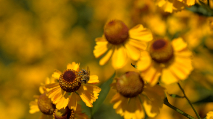
Honey bees in Ontario are dying in record numbers and the provincial government says a class of pesticides known as neonicotinoids is partly to blame. In an effort to reduce bee losses, the Ontario government is about to bring in a partial ban that will reduce neonic usage by 80%. 16×9 first looked into bee declines almost two years ago when we investigated the science behind how one of the biggest selling neonics was approved.

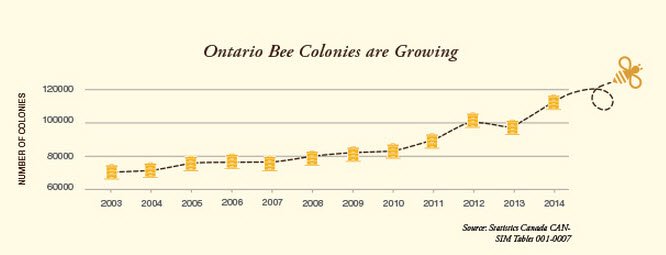
But industry groups say bees in Ontario are healthy and a ban would threaten farmers’ ability to give Ontarians local-grown food. In response to the new rules, a coalition of agricultural industry groups and Ontario grain farmers launched a campaign called BeesMatter with the mandate to get “the facts straight on Honey bees.” Using graphics with cartoon bees, the coalition published ads in major newspapers across the province.
Author/Source: beesmatter.ca
The BeesMatter campaign declares, “Ontario has a successful honey beekeeping industry,” and says over the last four years, honey production has gone up.
The data selected by the BeesMatter campaign is described as a “clever distraction from the real story” by senior scientist Clement Kent of the Howard Hughes Medical Institute in Washington D.C.. In response to the BeesMatter advertisements, Kent published his own interpretation of honey production numbers using the same data from Statistics Canada. He came to a very different conclusion and found that since 2003, average honey production in Ontario has gone down.
READ MORE: Proposed ban of suspected bee killer sets off massive fight in rural Ontario
- Posters promoting ‘Steal From Loblaws Day’ are circulating. How did we get here?
- Video shows Ontario police sharing Trudeau’s location with protester, investigation launched
- Canadian food banks are on the brink: ‘This is not a sustainable situation’
- Solar eclipse eye damage: More than 160 cases reported in Ontario, Quebec
“The peak of the trend is in 2003” says Kent. “In 2004, neonic‐treated corn seed was introduced to Ontario and by 2008, all corn seed from major companies had neonic treatments. During this time, Ontario honey production dropped dramatically.”
So, while both sides are relying on the same numbers, they reach opposite conclusions about what those numbers mean.
How numbers are presented can have a big influence on how a reader interprets information, according to Nancy Reid, a statistician at the University of Toronto. “Numbers are like words” says Reid. “People think they are facts but they are more like words than we realize.”
16×9 asked Reid to take a look at those same honey production numbers. She applied two different methods to measure the long term trends. Reid found overall “there has been a decline over the past 10 years” in honey production. “We can’t say the drop after about 2003 is due to neonics but we can only say there was a drop,” Reid warns, because “correlation is not causation.”
16×9 looked at the raw data and broke down the honey production statistics each side is relying on to back up their arguments.
1. CropLife’s graph
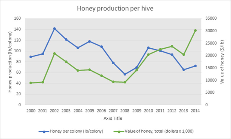
Author/Source: Email from CropLife Canada
Pesticide lobby group CropLife Canada sent 16×9 its interpretation of honey production numbers. CropLife’s graph starts in 2000 and measures the annual average honey production based on pounds produced per colony. On the same graph, CropLife also plotted a data series that shows the value of honey in dollars per pound has increased over the same time period.
2. CropLife’s numbers revisited


CropLife’s graph recreated using Statistics Canada data
Reid says plotting two data series on the same graph can imply a false correlation. CropLife’s honey production data comes from Statistics Canada and we’ve displayed it above, just as it was shown on the first chart without the price data.
3. Academic’s response

Author/Source: Clement Kent
In response to the BeesMatter campaign, Clement Kent published his own interpretation of honey production numbers. He used the same data from Statistics Canada but used all the data available going back to 1970.
Rather than plot yearly averages, Kent used a five-year moving average. This means the point plotted on one year takes the averages of the two years before, the year itself, and two years after. So, the point plotted in 1972 uses the averages of 1970-1974.
According to Reid, this way of looking at the numbers makes trends clearer because it smoothes out fluctuations like weather. For example, weather can be great one year and not the other, affecting honey production.
“When it comes to trends,” Reid says, “the goal is not to trace what happened back in time, but to get an overall picture”.
4. Both methods on the same graph

Source: Statistics Canada data
In an effort to get the most accurate information, 16×9 plotted average honey production using both CropLife’s method of yearly averages and Kent’s method of a five-year moving average on the same horizontal and vertical axes.
When plotted together going back to 1970, both numbers appear to show honey production was steadily increasing until around 2003. Since 2003, average honey production in Ontario has gone down.
Comments