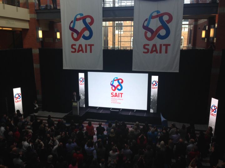
The last time SAIT rebranded its logo, Titanic won best picture at the 1998 Academy Awards, Jean Chrétien was prime minister of Canada and the Google search engine had been launched for the first time. Now, after 18 years, the Calgary-based polytechnic institute is changing that logo.

After nearly a year of research, Dr. David Ross, president and CEO of SAIT, unveiled the new logo during a ceremony in the Stan Grad Centre on SAIT campus Tuesday.
The new logo is more colourful than SAIT’s original red logo, something that Ross says was part of the plan from the get-go. In addition to keeping the logo red, removing the word “polytechnic” was also part of the rebranding.
Despite the decision to remove what had once been an integral part of SAIT’s name and logo, Ross assured the crowd that SAIT is still a polytechnic school and still a member of Polytechnic Canada.

Get daily National news
The new logo offers “more flexibility,” according to Ross. “There’s a lot more we can do with this.”
Input for the new logo came from over 4,000 stakeholders among SAIT’s students, faculty and stuff, alumni, employees and partners and the communities served by the school. The five S-shaped connectors of the logo represent those stakeholders.
While the unveiling of the new logo took place at SAIT’s main campus, the new logo has already been implemented at SAIT’s downtown culinary campus, the Mayland Heights Campus and the Art Smith Aero Centre. In addition, the transition to the new design has already been seen on SAIT’s website, social media outlets and other digital platforms.
The redesigned logo is part of SAIT’s strategic plan, which it launched in 2014. SAIT will work to implement the new logo over the summer so that it is ready for the new academic year.


Comments
Want to discuss? Please read our Commenting Policy first.