
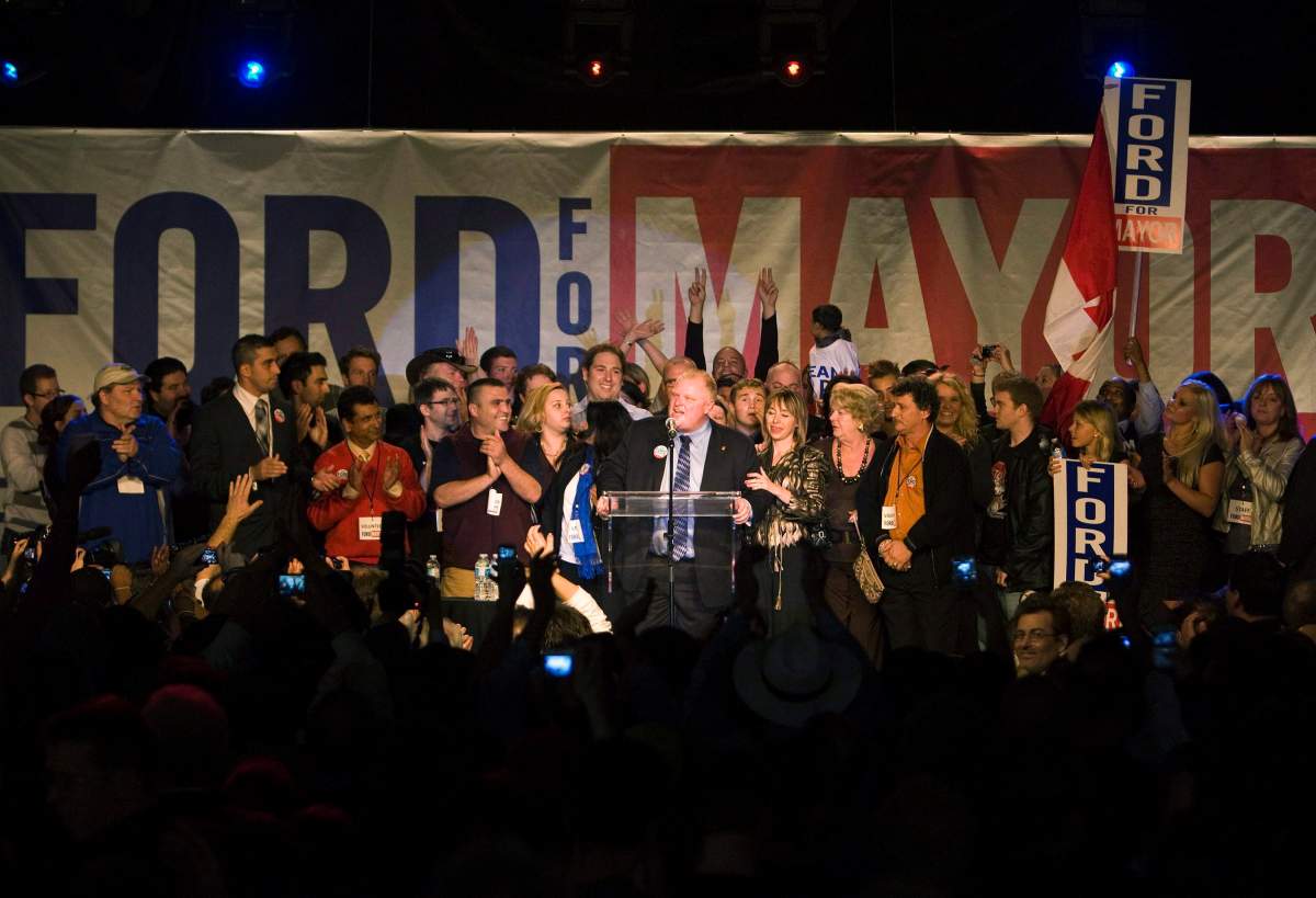
As Toronto’s seemingly never-ending election campaign enters its final stretch, Global News crunches tax and census numbers for every poll in the city to paint a detailed portrait of who, precisely, voted for Rob Ford in 2010 – and whom his campaign will be counting on for support this time around:

1) Loyalty splits along old city boundaries
In Toronto’s last mayoral election, support for mayor Rob Ford and second-place challenger George Smitherman eerily recreated the city boundaries ostensibly erased 12 years earlier.
The suburban city that developed after 1945, built to a car scale, voted overwhelmingly for Ford in 2010, while the prewar city, largely built around main streets that can be walked to, with streetcar and subway lines, voted for Smitherman – and, in a large pocket of the west end, third-place Joe Pantalone.
Interactive: Click a poll for details. Type an address into the box above the map, double-click to zoom; click and drag to move around. Use the dropdown menu to see more maps from the 2010 election.
2) Newer neighbourhoods vote Ford:
One way to track the age of a neighbourhood is to track the age of the houses in it. StatCan keeps data on the number of houses built before 1945. Except in the downtown core (where few single-family houses survive), this is an excellent key to neighbourhood age in Toronto:
Here is the corresponding map:
3) Immigrant-heavy neighbourhoods vote Ford:
4) Neighbourhoods with lots of single parents vote Ford:
5) Areas with declining family incomes vote Ford :
Census tracts with rising family incomes were less likely to vote for Ford, while tracts with falling incomes were more likely to. But the graph above obscures a lot of complexity: Incomes can fall in a census tract because a condo building goes up, for example, but that doesn’t mean the neighbourhood is in decline. (In the first decade of the 2000s, median family income in the Bridle Path fell sharply – from $241,000 to $213,000.)

Get daily National news
READ MORE: Explore GTA neighbourhood-level income data
6) People commuting by car vote Ford…
7) …and people commuting by transit do not:
-
![]() Cyclospora outbreak source not confirmed, health officials investigating link to lettuce, greens
Cyclospora outbreak source not confirmed, health officials investigating link to lettuce, greens -
![]() CN rail train drives through inferno as wildfires ravage northwestern Ontario
CN rail train drives through inferno as wildfires ravage northwestern Ontario -
![]() WestJet flight attendants vote in favour of strike
WestJet flight attendants vote in favour of strike -
![]() Immigration lawyer reacts as some “Lost Canadians” told to return citizenship certificate
Immigration lawyer reacts as some “Lost Canadians” told to return citizenship certificate


The two graphs above, taken together, suggest the real reason Ford loves subways is because they appeal to voters who don’t use transit, but like the idea as long as it doesn’t get in the way of their drive to work.
8) People with university degrees don’t vote Ford:
9) Anglophone-heavy neighbourhoods don’t vote Ford:
10) Neighbourhoods with lots of singles don’t vote Ford:
11) Urban form is more important than income
Urban/suburban distinctions made far more difference in 2010 than anything based on income. While there seems to be a small negative relationship between income and support for Ford, there were many urban low-income neighbourhoods, such as the apartment buildings on Jameson Ave. in Parkdale, that voted for Smitherman; at the same time, many suburban high-income neighbourhoods such as the Bridle Path voted for Ford.
In other words, if you want to interpret the 2010 campaign as being largely about income inequality – rather than urban form and how it shapes the lived experience of the city – there are many things that have to be explained away.
…and highrises don’t matter, either:
Comments
Want to discuss? Please read our Commenting Policy first.