After a long winter, the pastel colours of spring look pretty appealing right now. Cheerful pastel pinks, yellows, greens and blues can seriously brighten up a room.

Decorating with these potentially too-sweet shades can be tricky, but worth it.
“Pastels get a bad rap for being super-girly, sometimes being kind of ’80s, and for even skewing babyish. But they don’t have to be any of those things if you apply them in fresh ways,” says designer Brian Patrick Flynn, founder of Flynnside Out Productions.
“Pastels are like Sandra Bullock or a little black dress. They are always going to be in fashion and will remain classic for the masses. I say, use pastels however, whenever, and just be sure to put your own spin on them.”
Here, Flynn and two other interior designers — Betsy Burnham of Burnham Design in Los Angeles and Toronto-based designer Meredith Heron — offer advice on making spring pastels work in your home.
___
CONSIDER YOUR LIGHT
The natural light in a room impacts how a pastel colour actually appears, says Heron. East-facing windows bring a cool, blue light during the day, while west-facing windows bring in a redder light in the afternoon and at sunset. Heron says south-facing windows tend to offer a yellower light.
“My rule of thumb is to avoid the pastels that correspond to the direction of the light,” she says. “So no pinks in a western-facing room or they will look like something out of an antacid commercial.” Likewise, avoid pastel yellow in a south-facing room and blue in an east-facing one.

___
SHOP CAUTIOUSLY
The names of paint swatches can tell you a lot. “If something has ‘baby’ in front of it — baby blue, baby pink — be careful,” says Burnham. You’re safer “if you see ‘pale blue.’ The interpretation can be all kinds of things, from periwinkle to a grey-blue.”
If you’re drawn to a true baby pink or baby blue on a swatch, consider going with a slight variation on it. Often, on one paint-swatch card you’ll find four or five variations on the same colour, some very saturated and others with more grey mixed in. Consider picking one of the greyer, less saturated shades.

It’s useful to look through design magazines for inspiration, but Burnham notes that what looks great in a photo might not in real life. That’s especially true if the photo depicts a “show house” designed to highlight a designer’s talent, rather than a home that people actually live in.
___
A LITTLE GOES A LONG WAY
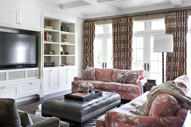
“One pastel is really great,” Burnham says. “It stands out and shines on its own.” But the effect is lost when you bring in additional pastels; you don’t want the room to feel like a basket of Easter eggs.
If you’re having trouble choosing just one shade, Flynn suggests blue: “Robin’s egg blue is probably the most iconic pastel used for interiors,” he says. “Believe it or not, robin’s egg is almost like a neutral. It works with almost any colour in the spectrum. I like putting a transitional spin on it by layering it upon itself in different shades and tints. It creates a classic, timeless look that’s applicable to all ages, styles and both genders.”
Once you’ve chosen your pastel, it’s safest to bring the colour in gently through an accent piece, such as a lampshade or artwork. Or paint your walls a white or grey shade that has just a dash of your favourite pastel mixed in.
“I always warn clients that pastel shades can get about 20 per cent brighter when you paint them on a wall, so opting for something that appears to be a white with a hint of colour is often your best bet,” says Heron. “I think people often choose colours that are too literal — too bright, too saturated, when just a dash will do you. If you want to dabble in pastels, start with a greyed series and then ease your way into something a bit brighter. Layers are always the key.”
The safest way to layer a pastel is by mixing in neutral colours like taupe, Burnham says, and organic materials like natural wood.
___
DON’T FORGET THE EDGE
In spaces where Flynn uses pastels, he says, “I’m all about adding a ton of edgy elements to make the overall look fresh and anything but sweet. My biggest tip is to balance the Easter tones with street art or modern furnishings, which create excellent tension between the soft sweetness and whatever elements are used to give it more of a masculine, urban or fresh edge.”
Heron often does the same, using animal prints, say, or art deco furniture to “include some bold statement.”
Her goal: “to inject a little bit of ‘ugly’ into a room, to keep it from being overly saccharine. … Ugly makes a room look and feel lived in, like it has evolved over time.”
Comments