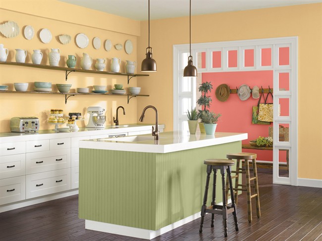
For 2015, the hot colours in home decor range from yummy ice cream pastels to a few deep, saturated hues.

The pastels include blush, sky blue, vanilla, lilac and pale peach, hues traditionally associated with tropical or desert climes. But they work in northern light, too – just ground them with darker shades like charcoal, chocolate or navy.
Mint and shell pink might seem lightweight or juvenile at first glance, but the way they’re being used gives them some gravitas. A task lamp; a midcentury-style chair; a bookcase – rendered in one of these hues, a room instantly looks Right Now. Mints to consider include Behr’s Mountain Mint and Pratt and Lambert’s Glacial Green; check out Pratt and Lambert’s Coral Pink and Behr’s Secret Blush for a gentle yet sophisticated soft pink.

Each year, paint companies and colour trend gurus assess which hues will be hot in fashion and decor. Many choose a “colour of the year.”
Coral Reef, a vibrant pink-orange, is Sherwin-Williams’ pick. Debra Kling, a New York-based colour consultant, thinks it’s a region-specific hue.
“It feels more suitable for South Beach, the Southwest or the South Pacific,” she says.
- ‘FLiRT’ COVID-19 subvariant dominant in Canada. What to know about the strain
- ‘I am silenced’: Did Miss USA leave a secret message in her resignation?
- RateMDs faces certified class-action lawsuit over alleged breach of privacy
- Power adapters sold on Amazon may cause electric shock, Health Canada warns
Jackie Jordan, colour marketing director for Sherwin-Williams, says the colour embodies a cheerful approach to design that’s a hallmark of 2015. “From our research, we know people do seek colours and decor that bring back memories of a destination vacation,” she says. “Coral Reef evokes that for people; others just love the colour.”
She suggests pairing it with white, black, or floral hues like lush green or deep violet to make it really sing. To calm things down, consider complementary shades of soft grey, driftwood or butter yellow. Patinated brass and medium wood tones would also be pretty accompaniments.
Benjamin Moore has gone with Guilford Green, a soft hue that some decorators and designers see as too pale while others tout its versatility as a “standard, go-to green.”
Framed with crisp white, Guilford Green gives off a pretty, garden-room vibe; add deeper floral tones like peony, daffodil and iris to enhance the botanical feel. Undertones of grey and brown make it a perfect colour against just about any wood, creating a restful backdrop for a kitchen, nursery or sunroom, and it’s a good exterior hue, too. Check out Farrow & Ball’s Breakfast Room Green, a similar shade.
Blues will also be strong this spring in decorative elements and room colour, evoking locations as diverse as the South Pacific and the Pacific Northwest. There’s global influence with indigos, while the navies have a preppy complexion. Behr’s Solitude and Vintage Velvet, and Benjamin Moore’s Blue Danube and Harbor Fog are all attractive. Glidden’s top colour for 2015 is a beachy, intense Caribbean Blue.
Another blue getting buzz is Pittsburgh Paint’s colour of the year, Blue Paisley. Some designers think it’s pretty but not especially “new,” since it’s been punctuating the popular grey palette for a couple of years now. Nonetheless, it’s a colour with legs. You’ll see it and a deeper teal in accessories and textiles, and as accents on smaller furniture pieces. It can lend a midcentury esthetic to trim upholstery and woods like pecan and walnut that speak to retro style but also reference classic taste.
Colour giant Pantone has deemed Marsala its colour of the year. New York designer Elaine Griffin is delighted: “I think it’s a winner. Red is a colour that we haven’t seen in a while. In this interpretation as a deep-ish wine hue, it’s both fresh-looking and sophisticated, and pairs stylishly with the new neutrals of grey, smoky teal and black.”
Kling said some colours have a mysterious quality “one can’t quite identify – and Marsala is one of them. It draws us in. Not quite brown and not quite burgundy, Marsala lends sophistication and warmth.”
She says it’s well-suited to textures, and as a saturated hue it’s something special; she just did a velvet chaise for a client in Marsala velvet.
While it’s already emerging in some furnishings, appliances and cabinetry, Marsala will likely turn up in much more from retailers come fall; it projects coziness, warmth and luxury.
Watch in the fall, too, for olive green, deep teal, burnt orange and mustard, all punctuating midcentury modern style. Fruity acid versions of lemon, lime and grape will nod to mod, ’70s-era decor.
Pratt & Lambert’s colour of the year is Noir, a bold, inky blue-black. Kling calls it sultry and forbidding. A tray ceiling in a master bedroom, painted like a night sky, comes to mind.
“I can imagine a lacquered Noir library, dining room or other cozy space used primarily at nighttime,” she says.
Griffin loves the bold choice. “Black and deep navy were once seen as the most theatrical colours, the exclusive domains of the uber-stylish and certainly not for the faint of heart,” she says. “But 2015 officially heralds their establishment as neutrals.”
Comments