


One of the top public policy issues of the last few weeks is what I’ll call the vaccine gap — the gap or difference between the amount of vaccine in freezers and the number of doses in actual arms.

The discussion on that topic has appears to be loudest in Ontario where the premier, Doug Ford, has continually asked Ottawa for more vaccines for his province while Ford’s political opponents point out that province cannot even use up the tens of thousands of doses in freezers and other storage.
And yet, the reality is that for all provinces, there will always be doses in freezers at the end of the day. The key is to look at the relative amount of doses administered versus doses in freezers, the vaccine gap.
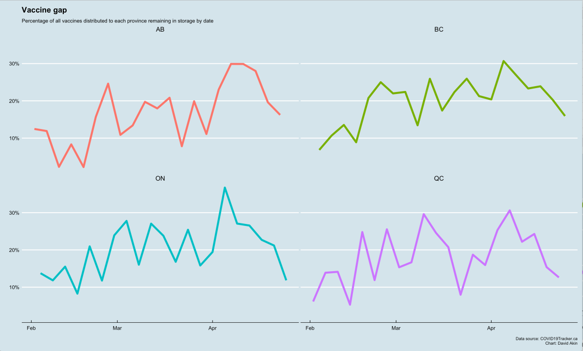
And by the metric of the vaccine gap percentage, Ontario, it could be argued, is doing roughly as well as its big-province peers — Quebec, British Columbia, and Alberta — and, in the last several days, you could argue Ontario is doing best — if “best” means fewest unused vaccines relative to all vaccines provided to the province.
You could argue — and many are — that it may now matter more which arms are getting the jab rather than how many arms getting the jab, but for this analysis, we’re just looking at the rate at which a province receives vaccine and gets it through the distribution system and into arms.
Ideally, a dose would be delivered by Ottawa to a province and the province would see that dose get immediately into an arm. That would be a vaccine gap of zero. Zero per cent of all vaccines delivered end up in overnight storage. 100 per cent go right into an arm.
But we know vaccine delivery is “lumpy”. Vaccines are delivered to the provinces once a week or once every three weeks or otherwise infrequently. But provinces need to maintain dose administration programs that are operating all the time, in different circumstances and in different regions. And so provinces will dole out vaccines daily from stores which get replenished infrequently.
So let’s assume a system were 1,000 doses are delivered every four days and a receiving province has a finely oiled machine to use all those doses up before the next delivery happens.
That province might choose to do things like this:
- On day one: 1,000 doses delivered. 250 administered. 750 in the freezer.
- Day two: 0 doses delivered. 250 administered, 500 in the freezer.
- Day three: 0 doses delivered. 250 administered. 250 in the freezer.
- Day four: 0 doses delivered. 250 administered. 0 in the freezer.
In our example above, we can calculate the vaccine gap as a percentage of all doses delivered ever versus the number of doses in a freezer on any given day.
- Day one: 75 per cent of all doses delivered are still in the freezer.
- Day two: 50 per cent of all doses still in the freezer.
- Day three: 25 per cent in the freezer.
- Day one: 0 per cent — all doses delivered now in arms.
Now, if we only evaluated a province’s performance on day one, we’d probably be howling with outrage. You stuck 75 per cent of all your doses in a freezer? How could you?

Get daily National news
But by day four, we’d be applauding that province for putting every dose it received into arms.
Again, referring to our example of the four days above, the average is 37.5 per cent. So we could say that province has an average vaccine gap of 37.5 per cent.
So if Doug Ford, to use him as an example, believes he can maintain an average vaccine gap of 37.5 per cent, then by all means, he should ask for 10,000 doses to be delivered every four days because he’ll dose 2,500 each day in our example above. And yes, on some days he’’ll have thousands in the freezer, but on others he won’t. In fact — Ontario’s actual vaccine gap has rarely been above 30 per cent in the last few months — it peaked at 36.7 per cent on April 5 but, but on Monday — with 4.7 million of the 5.2 million doses it has received all time, that vaccine gap percentage had dipped to 10.5 per cent.
The point is, no matter how many or how few doses are provided, there a certain per cent of all doses ever delivered to any province will be in storage or in transit. That’s the way the system works when deliveries come infrequently but dosing is constant.

-
![]() Challenges facing Canada to get some COVID-19 restrictions lifted by summer
Challenges facing Canada to get some COVID-19 restrictions lifted by summer -
![]() 75% of Canadians need 1st COVID-19 vaccine for less restrictions in summer, Tam says
75% of Canadians need 1st COVID-19 vaccine for less restrictions in summer, Tam says -
![]() Canada reaches 10.8 million COVID-19 inoculations: Dr. Njoo
Canada reaches 10.8 million COVID-19 inoculations: Dr. Njoo -
![]() Justin Trudeau remains confident in Canada’s COVID-19 vaccine rollout, border measures: full interview
Justin Trudeau remains confident in Canada’s COVID-19 vaccine rollout, border measures: full interview


Takeaway: So long as a province is demonstrating a consistent vaccine gap, that province would seem to be justified in looking for more doses. If its average vaccine gap rises, though, that may be signs of a problem.
And indeed, the big four — B.C., Alberta, Ontario and Quebec — have been able to maintain relatively consistent vaccine gap percentages since Feb. 1. More interestingly, their percentage of vaccines in storage all spike at about the same time — Moderna shipments arrive once every three weeks or so and Pfizer comes once a week — and then they all draw down on their stocks.
All four of those provinces have had their vaccine gap dip below 10 per cent in the last three months; all have eclipsed 30 per cent at times at times over the last three months. But all are trending in the right direction recently and, in the last few days, Ontario’s vaccine gap is the smallest among the big four. (You should be able to click on these charts to get larger image, by the way.)


Here’s the same comparison but this time I’ve mixed in all provinces and territories.
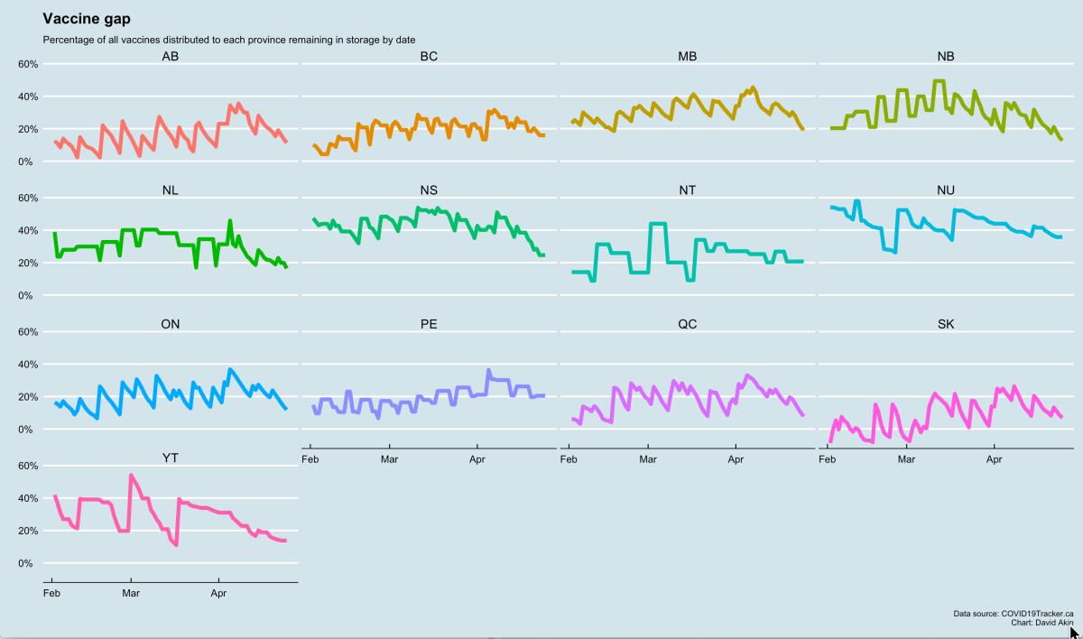
Takeaway is the same — all provinces have maintained a roughly consistent vaccine administration performance and for all, recently, the trend is going down. Vaccines come in, get into arms more quickly, resulting in a lower vaccine gap, i.e. unused vaccines in storage.
So if you’re with me this far, let’s bring in a boxplot chart to visualize the comparative performance of each province and territory over the 84 days since Feb. 1 using this vaccine gap percentage idea.
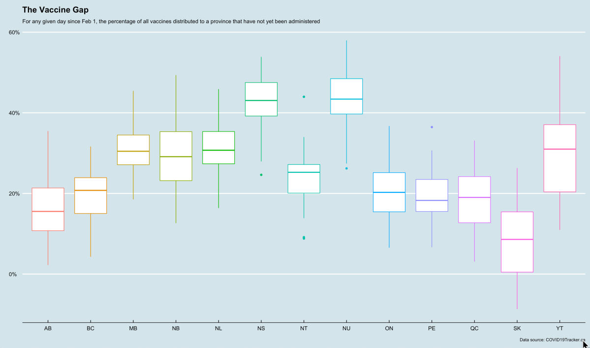
For each province there is a box with what are called “whiskers” on the top and bottom. In the middle of the box is a solid line. The solid line, in this case, represents the median vaccine gap as we’ve described it above for each province. So, Ontario’s median vaccine gap since Feb. 1 is right around 20 per cent. That means for the 84 days since February 1, Ontario has had more than 20 per cent of all the doses its ever received in the freezer for half of those days and less than 20 per cent for the other half. In the boxplot chart, lower median vaccine gaps are better. Among all the big provinces, Alberta has the lowest median.
Now the size of the box also tells us something. The box contains the ‘observations’ of the vaccine gap percentage for half the days since Feb 1. Which means for Ontario box, we could eyeball that box and say that half the time since Feb. 1, Ontario’s vaccine gap was somewhere between about 15 and 20 per cent. A flatter box in this case is better in that it indicates a province is showing consistency in performance — keeping its vaccine gap relatively stable. Saskatchewan and New Brunswick have relatively tall boxes implying that those provinces are a bit more unpredictable with their vaccine delivery performance with significant swings in the measurement period from Feb. 1.
Read more: ‘Demand is outstripping the supply’: Is Canada running out of AstraZeneca COVID-19 vaccines?
Now remember, the box is a graphical representation of the vaccine gaps for half of those 84 days since February 1. The whiskers are graphical representations of the other half of those days since Feb. 1. The top whisker tells us how things looked on the worst 21 days since Feb 1 — when the vaccine gap was greatest and the bottom tells us how things looked on the best 21 days of that period, when the vaccine gap was lowest. Saskatchewan, as you can see, actually had a negative vaccine gap at some point since Feb. 1 and, looking at the raw data, they did indeed when, on Feb 2, Saskatchewan had administered more vaccines than had been delivered to it. Don’t ask me how that happened! You can consult the source of the data for all these charts to COVID19Tracker.ca !
But again, the point here is that shorter whiskers imply more even or consistent performance.
The dots, by the way, represent the outliers in any province’s vaccine gap data, the days when that province wildly over-performed or under-performed versus all other days since Feb. 1. So Northwest Territories had a day when only about 10 per cent of all the vaccines it had received were in a freezer but it also had a day when about 45 per cent of everything it had received were not in arms, but were in freezers.
— David Akin is the Chief Political Correspondent for Global News.
Comments
Want to discuss? Please read our Commenting Policy first.