

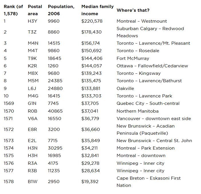
Patterns of wealth and poverty on maps are often the key to interpreting patterns on other maps. Murder sites of male homicide victims in Toronto, for example, follow the classic checkmark shape of the city’s low-income neighbourhoods. Using Google’s Fusion Tables mapping tool, we are able to map income across the country in 1,576 postal areas. Scroll down for interactive maps.

READ MORE: Explore our detailed census tract-based income maps. Which neigbourhoods are getting richer, and which poorer?
Vancouver and Victoria
In the Lower Mainland, some of the richer areas include West Point Grey and other neighbourhoods bordering the University Endowment Lands, as well as large parts of North and West Vancouver. Poorer areas are along East Hastings, in the Strathcona and Downtown Eastside neighbourhoods, as well as part of Burnaby. The FSA which includes the Downtown Eastside has a median family income of just $36,779 – nearly $30,000 less than the Canadian median. – Leslie Young, globalnews.ca
Maritimes

Get weekly money news
Outside major cities (especially Halifax) the Maritimes are consistently low-income, a pattern we also see in Newfoundland proper (below).
South-central Ontario
This map shows the wealth of the Golden Horseshoe, generally, with low-income pockets in inner-city Hamilton, parts of Toronto’s west end and Scarborough, and downtown Kitchener.
Prairies
The data shows the stark differences in wealth between Alberta, on the one hand, and Manitoba and Saskatchewan on the other.
- No injuries after transport truck collides with SUV on Highway 403: ‘Truly a miracle’
- Montreal Port Authority’s Julie Gascon out as CEO after less than 2 years
- ‘Goosebumps’: Taber, Alta. celebrates $250K win in Kraft Hockeyville contest
- Canada’s oldest Second World War veteran Burdett Sisler dead at 110


Greater Montreal
FSA income map: Montreal »
Newfoundland and Labrador
Newfoundland postal codes outside St. John’s are uniformly poor, but Labrador’s resource-based economy shows up as a bright spot on the map.
Greater Winnipeg
Winnipeg’s southwest, including newer developments such as Whyte Ridge and established neighbourhoods in Tuxedo and River Heights, show consistently high incomes, while the core area is inhabited predominantly by poorer residents of the city. – Lara Schroeder, Global Winnipeg
Comments
Want to discuss? Please read our Commenting Policy first.