It might be practical, of course, to decorate your home with neutral colours and muted earth tones. No need to worry about colours clashing if most everything is white, beige and light brown.

But what if you’re a fan of vivid orange, lime green or a luscious shade of lavender?
These colours can be tricky to use successfully in decor. But you don’t need to avoid them, says interior designer Brian Patrick Flynn, creator of the Flynnside Out design blog. Just use them carefully.
“It’s a game of balance,” Flynn says. “Once you get that right, just about any colour can be spectacular.”
Here, Flynn and two other designers – Kyle Schuneman of Live Well Designs and Betsy Burnham of Burnham Design – share advice on decorating successfully with even the most complicated colours.
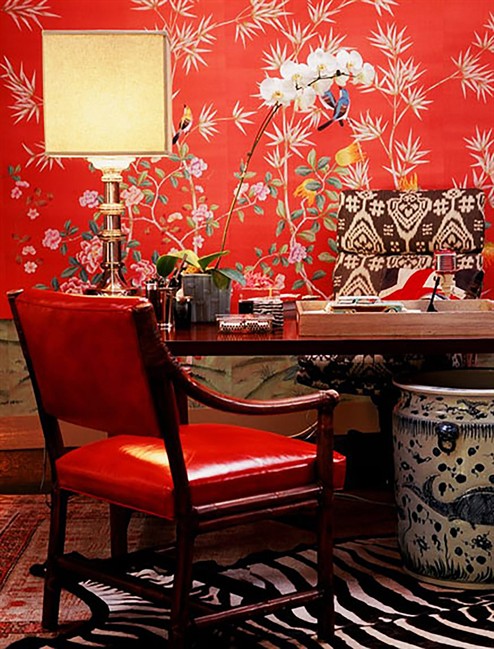
PICK ONE WILD SHADE
For a client who loved lime green, Schuneman covered one dining room wall with wallpaper that combined bright lime green with a muted sage green. He painted the other three walls in the neutral sage. That way, the client could enjoy a favouritecolour but the room didn’t feel overwhelming.
“There can only be one star in a room,” Schuneman says. “If you want a bold colour, then you already have your star.”

Get daily National news
Burnham agrees: “Orange next to screaming lime green next to fuchsia,” she says, “doesn’t belong in a grown-up space.” But fuchsia paired with olive green can look chic.
The same approach works for paler colours. Pastel pink used with pastel yellow and pastel blue creates an overload of sweetness. But Flynn has found that a light pastel pink can be gorgeous paired with a dark, calming navy blue.
ADJUST YOUR SHADE
When clients are considering a very bright colour, Flynn often advises them to choose one “two shades lighter or less saturated than the one they’re iffy about.”
“Nine times out of 10,” he says, “they end up still getting the effect, but without the colour becoming too saturated to live with.”
No matter what the colour, all three designers recommend picking a shade that’s got some grey mixed in. For a living room done in shades of purple and lavender, Burnham chose a sofa fabric that was a mix of grey and purple, and used a white paint infused with a bit of grey on the walls.
“Grey has a way of calming a colour down,” Schuneman says, making it “feel velvety and more soothing.”
ACCENTS INSTEAD OF WALLS


“There are lots of ways to incorporate colour without having to commit to a wall colour,” Schuneman says. “Paint an old media cabinet in a bold purple to make it a hot conversation piece.”
Taxicab yellow walls would be awful, says Burnham, but one bright yellow throw or ceramic lamp could satisfy your desire for that shade without overpowering a room.
If your heart is set on a tough colour and you’re not content with adding just a single accessory, Burnham suggests consulting an expert. Many interior designers will do a colour consultation, walking through your home to discuss how favouritecolours might work there.
EMBRACE THE BLUES
Rather than layering a room with creams and beiges, Schuneman suggests blues.
“I actually think of blue as a neutral,” he says. “I love it and always have it in my house, and have used shades from sky to royal to navy.”
Even vivid blues can have a calming effect. “Everyone gravitates to oceans and lakes, and it makes people feel good,” Schuneman says.
Flynn says the payoff can be fabulous. “To make a splash with blue in a bold way, I suggest using Klein Blue, also referred to as electric blue,” he says. “It’s got a ton of purple mixed in, so it feels rather royal. And when you mix it with red, it’s magical.”
Comments
Want to discuss? Please read our Commenting Policy first.