
The iconic wheat sheaf logo that’s been used on most
government documents and marketing campaigns since 1977 is being phased out in
some ways.

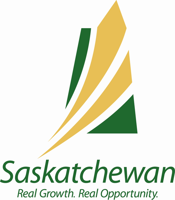
The new symbol popped up on the Government of
Saskatchewan website Thursday afternoon.
Donna Crooks, Executive Director of Communication
Services for Executive Council, says the new logo represents change and action
in a growing province.
“In the fall we said we really need to update the
government visual identity for consistency standards and to ensure it’s still relevant
for us today,” said Crooks.
It also moves us away from agriculture as our sole claim
to fame, but she says the wheat sheaf is still going to be used in some capacities.
“The wheat sheaf is still an important emblem of the
province and will still be retained as a logo on permanent signage,” said
Crooks. “I know people are proud of the wheat sheaf and it’s important that it’s
part of our visual identity.”
Marketing experts agree, in part.

Get breaking National news
Ben Tingley, President and CEO of Bravo Tango Advertising
Firm, says a new logo can re-brand your product to show new progress and
change. But, it’s not easy to get people to come around after being emotionally
attached to one logo for over 30 years.
Tingley says in cases like this, it may be better to just
rip the band-aid off so to speak.
“Personally speaking, if you’re going to change your logo
do it across the board in my opinion,” he said.
For the NDP this change is unacceptable, and repetitive.
In 2007 the Saskatchewan Party announced they would be
searching for a new logo, but they faced so much opposition to the idea that
they shut it down.
They did go ahead and update their external marketing
campaign symbols, and now they say this is a further expansion.
“The Sask Party in their arrogance decided to ignore that
advice and here we are again with a logo the people of Saskatchewan didn’t
want,” said Buckley Belanger, NDP Deputy Leader.
He says to add insult to injury, the new logo looks “dangerously”
similar to the Sask Party’s own logo.
“What’s happening here in the Sask Party is trying to
brand Saskatchewan with their colours,” he said. “They need to get away from
self promotion and start promoting Saskatchewan.”
It’s a point some agree with, but Tingley says it has
more to do with a smart colour choice by the Sask Party than anything else.
“I don’t think I could cry foul on that one,” said
Tingley. “They’re using our provincial colours.”
Putting the power of marketing aside, ultimately
symbolism only takes you so far.
“It’s just a logo. It’s ok,” said Tingley. “It’s what we
produce as a province that’s really going to shape who we are and what our
brand is.”
Comments
Want to discuss? Please read our Commenting Policy first.