TORONTO – Trying to decipher dose instructions written in small print on prescription medications or over-the-counter drug labels can be a daunting task for people with vision impairment or eyesight dimmed by age, say experts, who warn that squint-producing lettering can lead to potentially serious medication errors.

“I think there are risks for increasing people’s anxiety in taking medications if you can’t read it very clearly, or you have to struggle to read it,” says Susan Leat, a professor in the department of optometry and vision science at the University of Waterloo. “Some people may be able to read it, but it’s just harder than it needs to be or takes them longer.”
READ MORE: What will help doctors improve their patient care?
Leat says being unable to make out instructions on medication labels may also lead to a lack of independence, as patients have to rely on others to relate the information.
“You have to remember many people are taking two or three medications or more even. Some are taking up to 15 different medications a day,” she says. “They need to sort them out into ‘This one, I take two times, this one I take four times.’
“So having to rely on somebody else to do that because you can’t read the information very well takes away people’s independence, and their privacy as well.”
READ MORE: Healthy doctors make healthy patients, Canadian study finds
- Capital gains changes are ‘really fair,’ Freeland says, as doctors cry foul
- Ontario doctors offer solutions to help address shortage of family physicians
- ‘Dangerous message’: Experts slam anti-sunscreen claims circulating online
- ‘Trying not to die’: Tourism operators loaded with debt despite rising demand
While there are some guidelines for how pharmacies should present information on drug container labels, legislation in Canada only covers what critical information must appear on packaging – not how it looks.
Font size, whether letters are upper or lower case, word spacing and highlighting of certain words can make a huge difference to legibility, says Leat, who led a recent study that looked at prescription drug labels from a random sampling of 45 pharmacies in Kitchener-Waterloo and Cambridge in southwestern Ontario.
The pharmacies – both those from large chains and independents – were each asked to print out a medication label, using the same made-up patient name, drug and dosage supplied by the researchers.
READ MORE: Expanded role for pharmacists means better patient care, experts say
The authors then analyzed the legibility of what’s known as “patient-critical” information – the instructions for when to take the medication and how much, the name of the drug and the patient’s name.
Leat says more than 90 per cent of the pharmacies followed guidelines for font type – a plain style without flourishes, or sans serif – high-contrast lettering, black instead of coloured print, and non-glossy paper.
“But in terms of some other aspects, they were not so good,” she says.
Many of the labels used all upper-case letters, even though recommendations suggest using sentence-style, which means a combination of upper- and lower-case lettering, as one would see in a book or newspaper.
READ MORE: Medical wait times have nearly doubled in the last 20 years
Spacing was also found to be an issue with some labels, says Leat. “You don’t want the print all squished up together. You want to make the best use of space between the lines of print, because people with vision impairment and older people are generally going to have more difficulty when it’s crowded together.”
Highlighting certain words or phrases, such as instructions that say, for instance, “take two pills, three times a day,” are also helpful.
“But very few actually highlighted the instructions in that way,” she says. “And when they did … they used grey highlighting, which is not very good. Usually a bright yellow highlighting is probably better to bring people’s attention to that part of the label.”
And when it came to the all-important font size, only 44 per cent met the recommendation to use 12-point lettering, the smallest size considered to provide ease of reading, say the authors, whose paper was published last month in the Canadian Pharmacists Journal.
“We should be aiming for a minimum of 12-point, and bigger if possible,” says the optometrist, who ideally would like to see legislation governing how labels must be printed.
Having a standard labelling format among pharmacies would also help consumers, who may get their prescriptions from different drug stores.
“Some of the labels, they put the patient name first and the instructions afterwards,” Leat says. “Some of them put the drug name first and then the patient name. There’s no consistency in where the different pieces of information are on the label.
“So patients would not know where to look on the label to find the particular thing that they’re looking for.”
While that may not be much of a problem for those with 20/20 vision, it can be disturbing and even dangerous for many older people with diminished eyesight and those considered legally blind, says Deborah Gold of the CNIB, an advocacy organization for the visually impaired. Legal blindness is defined as having 20/200 vision or worse with the best correction in the better eye.


Many clients have reduced vision because of age-related macular degeneration, glaucoma or diabetic retinopathy, conditions that are all on the rise because of the aging population, says Gold, CNIB’s national director of research and program development.
The charitable organization has developed its own Clear Print Guidelines, which were among those used for comparison in the University of Waterloo study, she says, noting that they call for a font size of at least 16 to 18 points. For normally sighted readers, fonts should range in size from nine to 14.
While there are a number of gadgets that can help people with reduced eyesight, including simple magnifiers, having medication labels with larger-size print would go a long way in boosting legibility, says Gold.
“As the population ages, we need to be more concerned about people being able to access print, especially when there’s an issue of safety – and safety around medications would be one of those issues.”
A 2009 survey by the American Foundation for the Blind found that people with vision loss were unable to read necessary instructions supplied with prescription and over-the-counter medications, often leading to their taking the wrong medication, the improper dosage, and in some extreme cases, becoming ill or having to visit the emergency room.
In one example cited in the report, a 20-year-old man received the wrong dosage of insulin because he was unable to read the label: his prescription was for 50-unit insulin syringes and the pharmacy filled it with 100-unit syringes. He passed out from hypoglycemia, or low blood sugar, from taking too much insulin and ended up in a hospital emergency department.
Last year, Health Canada launched its Plain Language Labelling initiative, with the goal of improving the safe use of drugs by making medication labels and safety information easier to read and understand.
“It’s important to be able to read the information. It has to be legible,” says Christine Koczmara, a registered nurse who’s involved with the non-profit Institute for Safe Medication Practices (ISMP) Canada. “So this type of initiative that’s happening and moving forward, I think will greatly increase the ability to get the kind of information to the consumer that they need.”
Poor legibility on medicine bottle labels or other packaging not only affects consumers, but also health-care providers dispensing drugs to patients in hospitals, says Koczmara, noting that ISMP Canada has a website where errors that occurred in the “selection or administration” of a prescription or over-the-counter (OTC) pharmaceutical product can be reported by any consumer or health professional at http://www.ismp-canada.org/cmirps/.
Over the last 11 years, ISMP has received and analyzed about 2,000 reports, which it uses to promote change within the pharmaceutical industry, including those producing over-the-counter, or OTC, products.
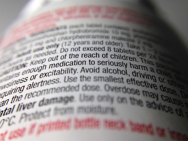
Leat of the University of Waterloo says the often “minute” print on many OTC medicines can be challenging to read, even for those with so-called good vision.
“You could argue that this is an even bigger problem because when you’re picking up a prescription medication, you have to go to the pharmacist, so at least you’re talking to somebody who can tell you,” she says.
“When you’re buying something over the counter, there’s nobody there to tell you how often you should be taking the medication. So it would be possible to overdose.”
Follow (at)SherylUbelacker on Twitter
Comments