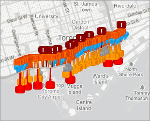
Building our interactive map of the Gardiner Expressway was a long process.

It started with an idea, of course. After hearing so many reports of concrete falling from the Gardiner during the summer of 2012, I wondered if maybe there was something we weren’t hearing. Was there more concrete falling than we knew about? Were there other problems?
This sort of thing tends to be well-documented by cities, so Freedom of Information seemed like the answer.
I made two Freedom of Information requests to the City of Toronto, one for all emails and communications products dealing with falling concrete on the Gardiner, and the other for all engineering and inspection reports.
When I got the information, it was a little more than 2000 pages long. So, I of course had to read it. It was at this stage that words like “punch-through” really jumped out at me.
The feeling was that if we were going to release a story like this online, it would be a shame not to visualize it. The obvious choice for a visualization seemed to be a map, since people were going to want to know where the problems were.
So we wanted to make a map.
The first step was to catalogue each event. This involved deciding on our criteria (loose concrete that presented some kind of risk. Either it had a high chance of falling, or it was above a high traffic area). I took my cues on the criteria from the documents themselves. Many of them are specifically categorized in this way.
- Life in the forest: How Stanley Park’s longest resident survived a changing landscape
- Bird flu risk to humans an ‘enormous concern,’ WHO says. Here’s what to know
- More youth are seeking EI amid rising unemployment rates: StatCan
- Mental health support still lacking 4 years after mass shooting: Nova Scotia mayor
This involved putting every document we had into Document Cloud, a tool for sharing and annotating documents, for easy categorization.
So, I read through every report that fit those criteria, looking for any mention of a location. I then entered those details into a spreadsheet and created a Document Cloud reference for every incident.
Almost all of the locations were referred to by “bent number” instead of an intersection. This meant that you would see a reference to “Bent 23-25” for example.
So, changing this into a useable latitude/longitude coordinate for mapping purposes required some extra work.
We purchased a technical drawing of the Gardiner that listed bent locations from the City of Toronto. Then I went through each incident, first placing it on a bent, then manually assigning coordinates.
Once the spreadsheet was ready to go, it was loaded into a Google Fusion Table. Global News’ newest web developer, Kate Grzegorczyk, built the interface in Javascript, drawing upon the Fusion Table data to create an interactive in-depth experience.
Since we published the story, the Gardiner has been a hot topic at city hall, with city officials responding with press conferences and councillors debating the merits of different plans for the highway. The problems we raised were news to both the public and to councillors, so the debate might have been very different without it.
Comments