
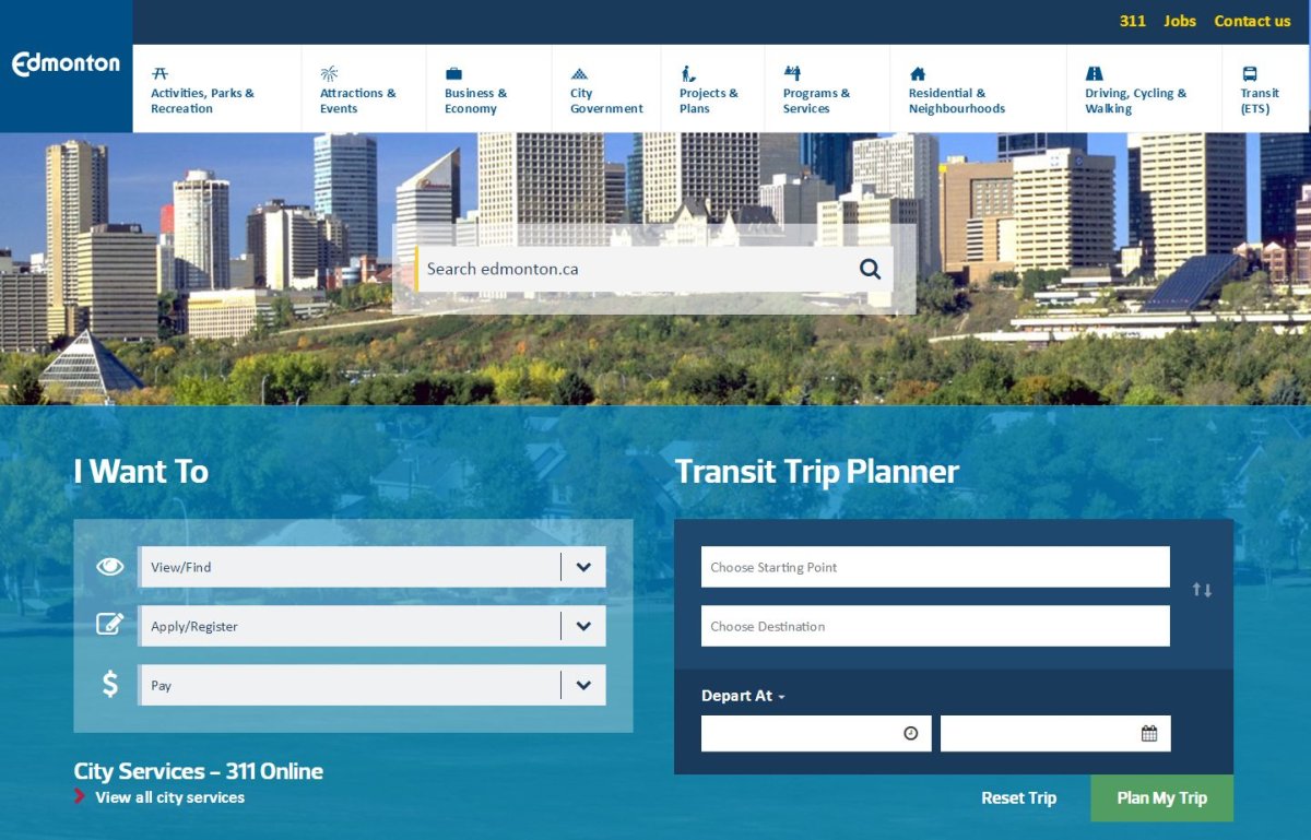
A new week brings a new look to the City of Edmonton’s website, which received a big update on Monday.

“Today, 60 per cent of our visits to the website are from smartphones or tablets. Therefore, it only made sense for our website to be mobile friendly,” an explanation of the change said.
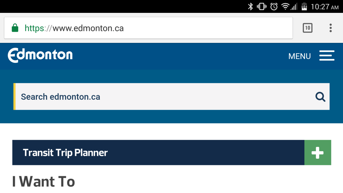
For the redesign the city partnered with Yellow Pencil Inc., a local web design, development and hosting firm. The new website has a responsive design that will reformat to fit any screen, much like Globalnews.ca does.
The city says while the website looks different, the content and where to find it will remain the same.


Below is a list of features the City of Edmonton says the redesign has:
- Responsive design – pages reformat to fit any screen, from phone to flatscreen TV
- Enhanced search function
- Refreshed new look
- Priority display for most popular content
- Clean and concise presentation of information
- Better self-service for Transit users
- Icons that improve access
The city said in the future it plans to add more self-service tools, revised navigation, and more feedback tools.
Because the city’s website contains over 5,000 pages there is the chance some might not have made the transition smoothly. The city asks any residents who encounter broken links to report the problem so it can be fixed.
- 2021 heat dome fuelled by climate change, intensified wildfire risk: study
- B.C. introduces legislation recognizing Haida Gwaii Indigenous title
- Whale experts confident B.C. orca calf will survive, find family if rescue plan succeeds
- Plastic production cap still contentious as Ottawa set to host treaty talks
Comments